Hi @reneramirez,
Welcome to Klaviyo and the Community! Happy to help!
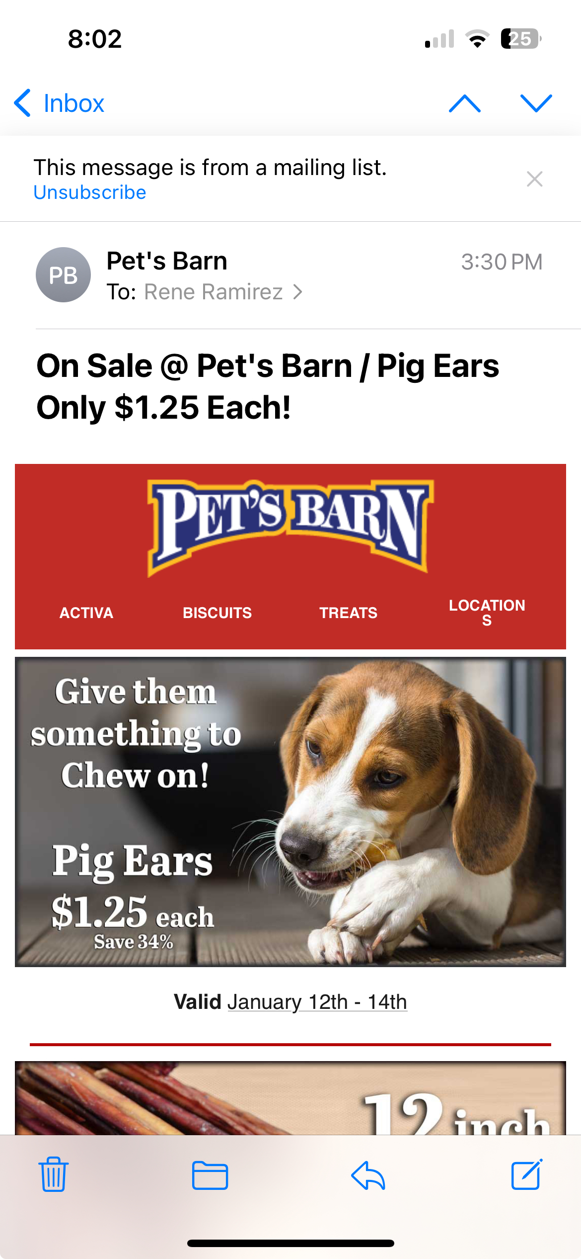
Is this screenshot from opening the email on the apple mail app? Have you tested on different email app providers and found similar or differing results?
Unfortunately, we can’t control how emails will ultimately render in inboxes, although our resources like mobile optimization, creating mobile only blocks, and others email preview services like Litmus or Email on Acid will show you what your emails will look like when rendered in inboxes. I’d also check out these threads to gain more insight!
https://community.klaviyo.com/email%2Dtemplates%2Dand%2Dcoupons%2D32/wrong%2Ddisplay%2Dof%2Dpreview%2Dmail%2Din%2Ddifferent%2Dmailing%2Dproviders%2D3068
Finally, as you’re new to Klaviyo, I’d check out these resources as well to keep growing your knowledge of the product!
Thanks for participating in the Community!
-Taylor
HI @reneramirez in addition to the great advice above, another option would be to have a separate menu for mobile, with perhaps one less menu item so there is more room and they don’t need to wrap.
Food for thought.
Katherine

