Hey!
With traffic acquisition becoming more expensive on FB, it’s become super important that we try to get qualified traffic into our owned ecosystem - either through a purchase or get their contact info (email, phone) while on the site.
One area we’ve put a focus recently is the latter - getting their email address. Our primary way of getting that email was through a first time visitor pop-up.
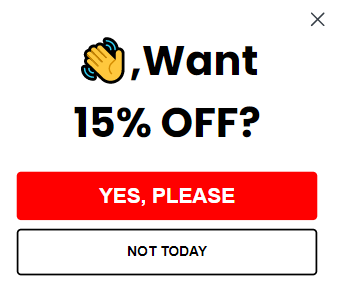
We were able to increase our opt-in rate from 3.5 - 5% on average to 8 - 9% by using a micro-commitment before the ask.

What does it look like in practice?
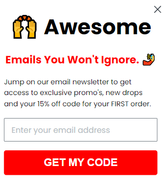
Here’s a screenshot of how it looks to the visitor.
- The micro-commitment (usually just a simple Yes or No, we’re not wanted to have the visitor do any work yet - ie type their email)
-

Screen 1 on the pop-up
-
- If they clicked “Yes, Please” we take them to the 2nd screen which is where we ask for their information. In this case, their email address.
-

Screen 2 on the pop-up
-
Why It Works
This is a concept we used in cold-calling sales all the time. I believe it comes from the book The Psychology of Persuasion. The idea is here that people like to be consistent with things they’ve done or said.
In this case, we ask the question if they want 15% off (who doesn’t if they are coming to the site?). Once they click Yes, they’ve raised their hand and identified that they want a discount. So, when they get to the next step, to be consistent with what they done the visitor is more inclined to take the effort and submit their email address.
If you use this and see success in it, post a screenshot or share your wins in this thread. I’d be curious to see how brands that don’t offer welcome discounts do with this tactic.
Here’s a Klaviyo help article on how to create a multi-step form, if you need it: https://help.klaviyo.com/hc/en-us/articles/4404213604251-How-to-Create-a-Multi-Step-Form


![[Academy] Klaviyo Product Certificate Forum|alt.badge.img](https://uploads-us-west-2.insided.com/klaviyo-en/attachment/8798a408-1d98-4c3e-9ae8-65091bb58328_thumb.png)


