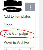
I have a few thoughts on ways to improve the Klaviyo User Interface and I wondered if there is a Forum Topic to offer feedback on this.
- It would be AWESOME if I could actually SEE the campaign I sent without having to click into the analytics. Like add the View Campaign link to the drop down/hover menu on the campaigns screen instead of having to click into the campaign to view it.
- I would like to be able to schedule the same email on a recurring basis. I send a weekly reminder about my Five Dollar Friday sale and right now I have to go in and set up two separate emails (two list segments) and schedule them to send but it’s the same email every week. Why not let me set it up to send every week automatically? Like a recurring event in Outlook or something
- One page with all the subscribe links for my various lists would be amazing, having to click into the list, click the subscribe/preferences page, click on the subscribe icon is TOO MANY CLICKS!
- The new editor doesn’t work well for me. It looks fine but when I preview the email, the spacer lines will jump to the top of the email or the footer icons (which I never change) get duplicated and jump to the middle of the page. I’ve also had spacers just randomly change places in my flow emails. Again, it looked fine in the WYSIWYG editor and then when I previewed it, the sections had moved.
If there is ever a focus group or user group to find out HOW people actually use Klaviyo (on the design side) I’d love to be part of it. I am using Klaviyo exclusively for email which I send two or three a week these days so I’m using it A LOT. I have lots of thoughts on how to make it a better UX.


