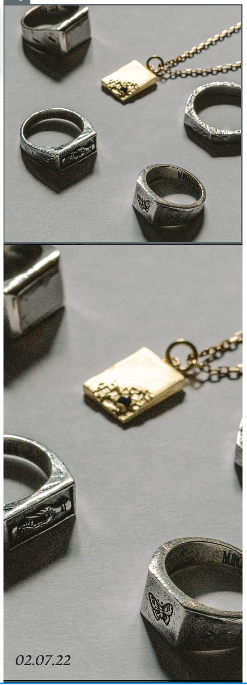
Background imagesare another new exciting feature of the new editor. You can drag and drop in a section and simply toggle on the background image button. Here, you can select an image that you want other blocks to pile on top of. It’s helpful to pick an image that doesn’t have words or one central focus - since content will be added on top of it. We suggest adding a ‘lifestyle’ shot to express the brand’s views/tone or mood. Once the image is added, you can drag/drop any blocks on top like a normal section. For more of the background image to show, you can increase the section’s padding top and bottom.
Stay tuned for my next post as I’ll be discussing a group favorite topic; building dynamic table blocks in the new editor!
we’re having trouble constraining images in mobile no matter how the image is formatted te.g. fill vs constrain. ] or the size it is uploaded in.
in the example attached: 1st section has a image block 2nd has a section background.
as you can see the image in the 2nd section is too tall in mobile and goes over the first fold.
why is this important: 2nd section has text over the top ebottom left of section]. in order to have the same effect it seems in the 1st section the only way to do is having text overlay on the image iphotoshopped on]
proposed solution: is it possible to constrain the image for mobile so it shows the full image with correct cropping rather than zooming in, can this be supported by using padding or spacers?
Hey! This was a really helpful video! What I am wondering is how I move an entire section...I tried to move it further down in the email and it didn’t seem to work. It seems that sections can only live at the top of an email?
Hey @Vbeebs,
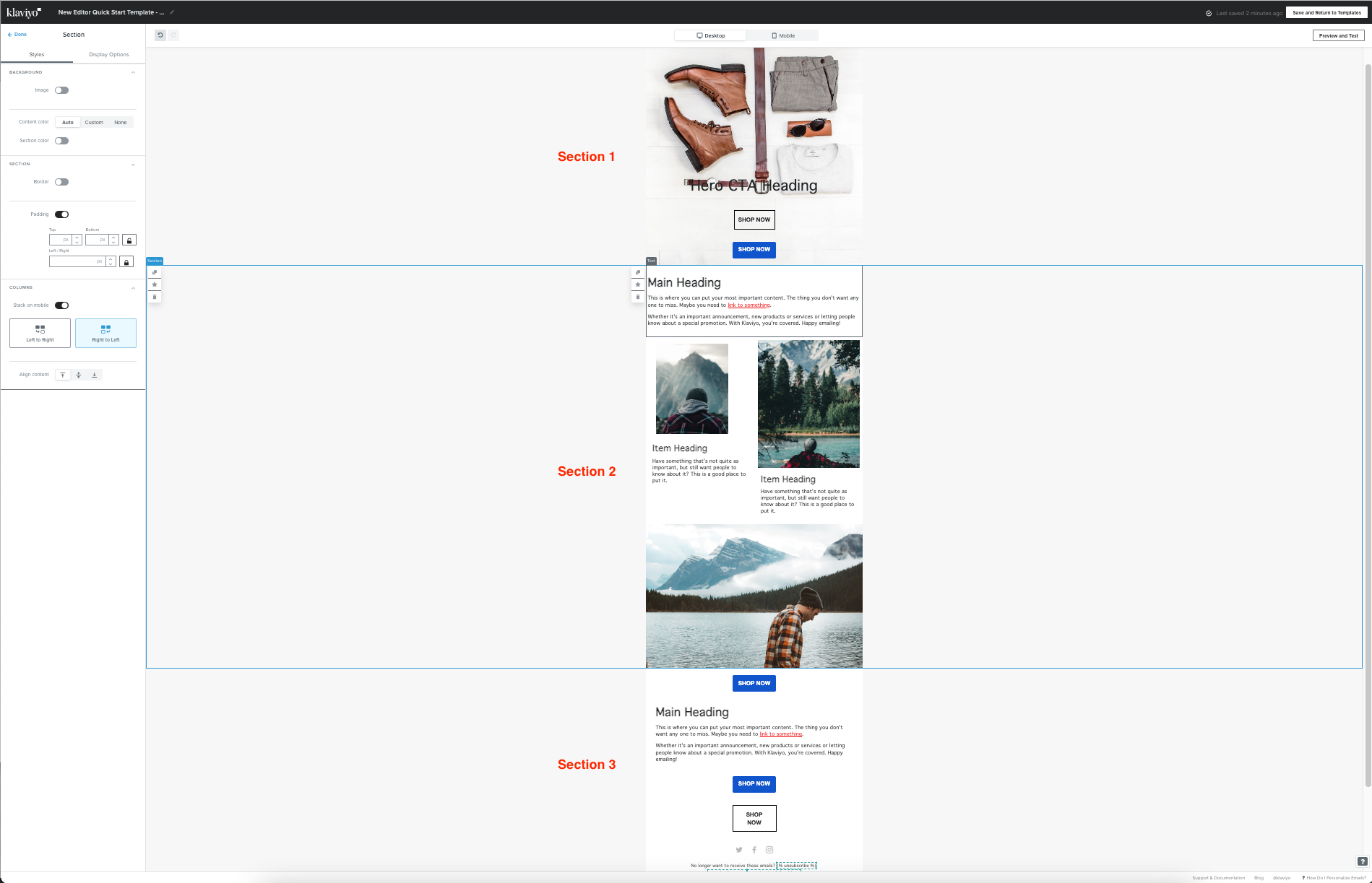
You can certainly move whole sections at a time within a template! The only constraint is that you wouldn’t be able to move a section into an area that’s already wrapped in a section. Essentially, you wouldn’t be able to nest a section within a section. Sections can only stack on top of each other, but moving them and reordering them in your template is totally doable!
For example, in my screenshot above, I can can certainly move Section 1 either below Section 2 or Section 3. However, I would not be able to move section 1 under the “Main Heading” section of Header 2.
David
Thank you for that — I will have to try this again!
Hello!
Quick question, is it possible to make the background image clickable so that no matter where the mouse is over that section it’s a clickable area?
Right now I have to use an image that I edit outside of Klaviyo to add text and a button to ensure that the entire thing is clickable, however I would rather add a URL to the background image so I can add text and buttons inside of Klaviyo.
Thanks!
Hey @Jon Avalt,
I think the method you’re using would still be the best option to make an entire section a clickable area.
Sections are great at grouping blocks together. But they are just that, a means to group elements of the template together while allowing you to apply a background. Just like how you’re able to apply a background to the entire template, it doesn’t make it a clickable image.