Solved

"Full-width on mobile" in text box not deleting extra padding on mobile view


Userlevel 2
Badge +5

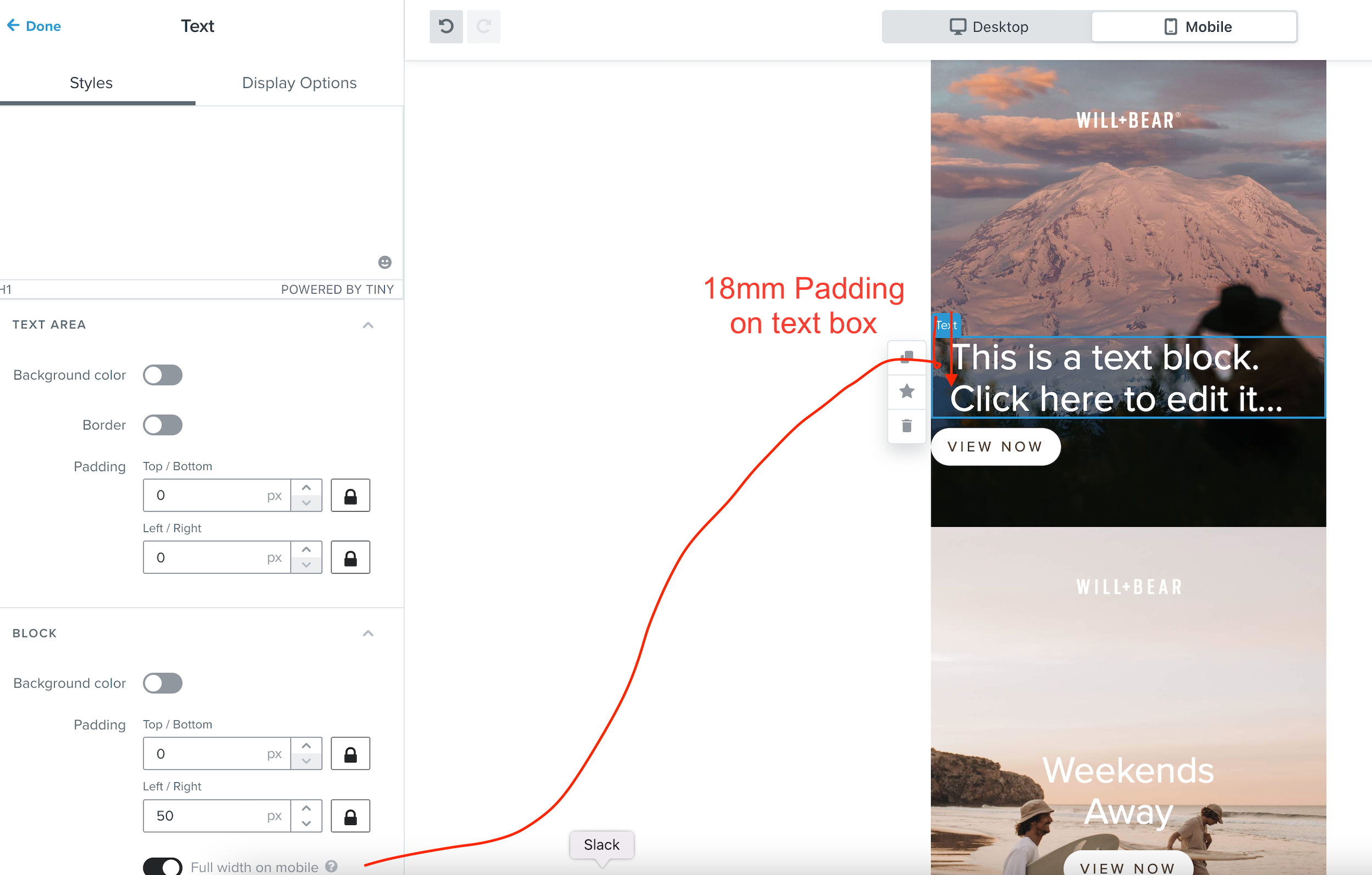
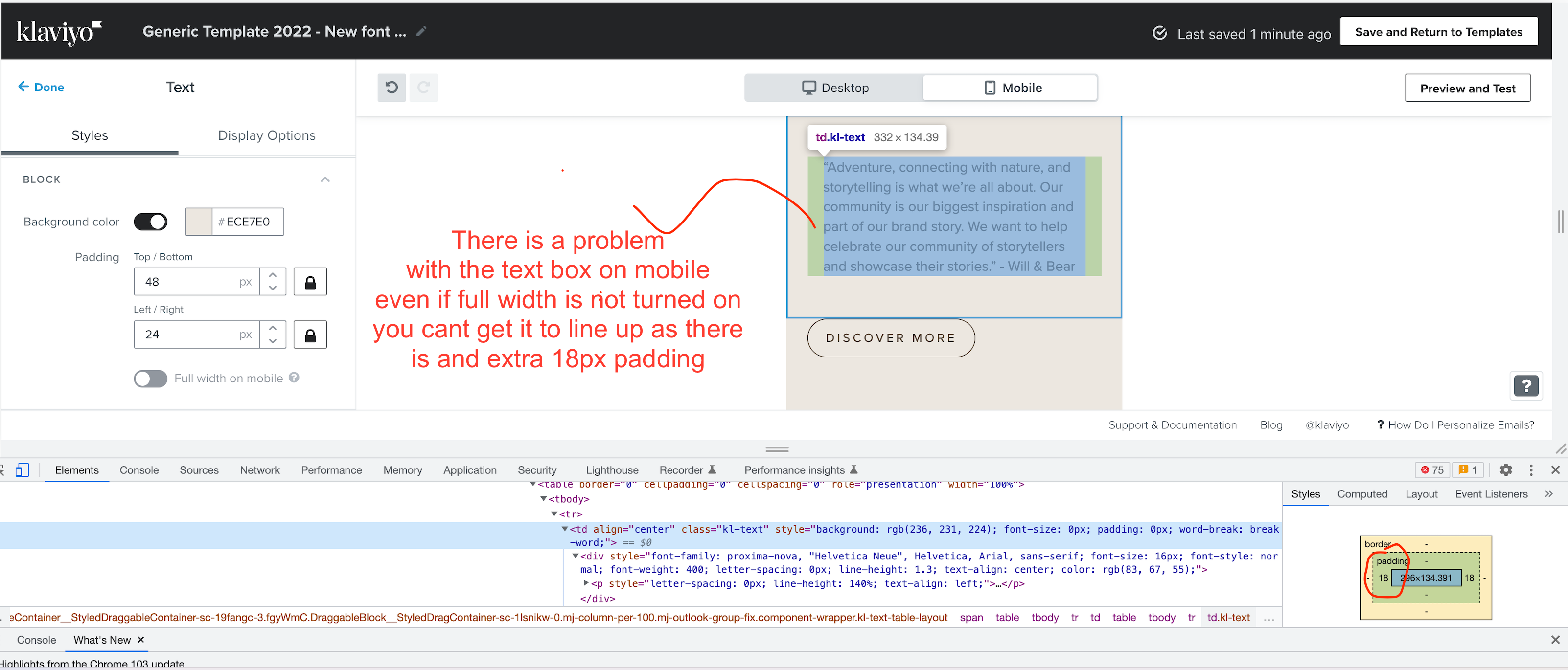
The text box component in the new editor has a “full width on mobile” option, but it doesn’t work as expected. When enabled, the text still displays 18px padding on left and right, making it look indented, instead of full width. I’ve reached out to support about this, thinking that it must be a bug, but they told me this is the intended behavior.

So confusing. What would be the point of having a “full width on mobile” option that doesn’t make the text full width? Any thoughts?

-oo

icon

Best answer by Taylor Tarpley 11 August 2022, 22:37

View original

This topic has been closed for comments

10 replies

Userlevel 7
Badge +60

Hi @Doubleo


Thanks for sharing your question with us!


Yes, we have recently updated the “full width on mobile” feature in our template. Previously, it was taking away padding from the image and text portion of a block, when it was only originally planned to remove the text padding of the block in question. This will be a visible change if one is used to this feature removing both paddings instead of simply the text padding, leaving the image padding in tact. 


However, I can see that the issue here seems to be with your text part of you block not removing the indicated padding when the feature is toggled on. Unfortunately,  it’s hard to troubleshoot template issues in the Community as we cannot look into the backend of what’s happening here. Since you have an open ticket with our support team as mentioned before, I would suggest continuing to work with this team member to get to the bottom of the issue as they have access to more information in your account.


Thanks for sharing your experience with the community!

-Taylor 

Userlevel 2
Badge +5

Hi @Taylor Tarpley 

Thanks for the response. I’ve been in contact with Support all along. And they’ve told me that a bug that’s related to how images with borders looked when full-width on mobile is selected has been “fixed”, and this new behavior is a byproduct of it.

That’s all good, but I think the whole full-width on mobile doesn’t even make sense anymore. Toggling it on has literally no effect on the mobile layout of the text box.

When I enable full width on mobile on say, the horizontal rule element, the line goes all the way from left to right. So it’s natural to expect the same behavior from the text box as well. Am I wrong?

Thanks, -oo

Userlevel 2
Badge +5

Any thoughts on this @Taylor Tarpley?


Badge

@Taylor Tarpley I have this same issue. This is actually a fairly big deal since many layouts and saved blocks that were relying on a properly functioning “full-width on mobile” toggle, are now broken. This is a serious bug.

Its easily reproducible : just make a text block with padding and toggle in the mobile view. The toggle does nothing. Has this been noted as a bug and is there are plan of action to resolve this?

Userlevel 2
Badge +5

Thanks @Keith-o. Unfortunately my attempts to elevate this as a bug went nowhere. After some back and forth with support, this was brushed off as “this was always the intent”.

Support also told me to use the table block instead, as “the only way to remove the left and right padding in mobile”. However, the text in the table block does not respect the mobile text styles assigned in the styles tab, making it appear at the desktop size on all devices. So you’re out of luck unless you use inline styles for mobile breakpoints. (this itself is also a bug-worthy issue for the table block if you ask me) 

Huge miss in my opinion. Something called “full-width on mobile” should just work as expected.

Badge +2

Still haven’t fixed this issue. I have the same issue with the text padding below see the image below. If i inspect that element i can see the 18px padding still in the code.

We also cant create a button with a transparent BKG?

If you really are a unicorn company give you user the basic tools please….


Badge +2

How do I create a left justified layout of a text box and a button ON MOBILE?


There is an extra 18mm padding whichever way I go. Switch to desktop and the padding lines up as you would expect, in this case 24px. Are you guys using the tools?


Userlevel 7
Badge +60

Hey all!


Thanks for your patience here, I’ve raised your questions with our template team to ensure we get an answer for what’s happening here! I will circle back when I’ve confirmed with our specialists. Again, thank you for your patience I know this issue has been very frustrating issue for you all! 


Will touch base soon and thank you for your patience! 

-Taylor

Userlevel 7
Badge +60

Hey everyone, 


After touching base with our template specialist, they do see the issue and agree that this behavior is not intuitive and doesn’t satisfy the design need. We apologize for this inconvenience and will be improving this functionality so that it is consistent across all content types and works the way our customers expect it to. Thank you for bringing this up as this has brought the conversation to a broader team at Klaviyo! 


-Taylor 

Badge

I was looking into this specific issue myself as this feature causes buttons to no longer align with text when on mobile view.

Seems to be an issue with text boxes having the CSS class: kl-text which adds 18px of padding left and right with no way to adjust this as a user.

Using the inspect tool and removing the CSS class: mob-no-spc from the button and replacing it with the kl-text class made it function in a way that aligned my button with my text.

I understand wanting to keep padding when forcing text to full width as it may end up being cut off for some viewports but maybe allow users to then apply the kl-text class freely to other elements so that they align with the text boxes?

Could be implemented through a toggle option within default block styles. 

Thanks for your time and I look forward to a fix.