Hi there. I’ve recently started using the new editor. I have an issue where the Header/Link block adds unwanted padding to the logo section in mobile. No issue on desktop.

There is no padding issue on mobile in the rest of the email. Full width elements are full width on mobile just fine.

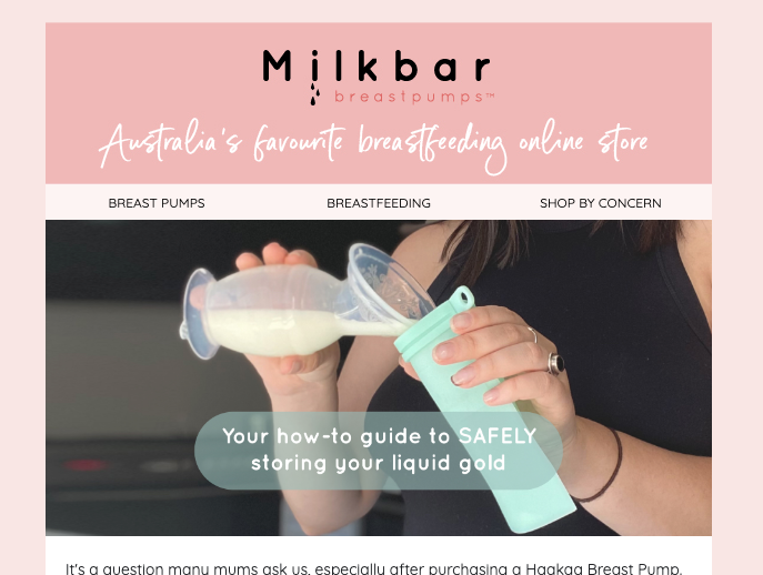
This is the desktop preview, the logo section is flush with the image below as designed:
 

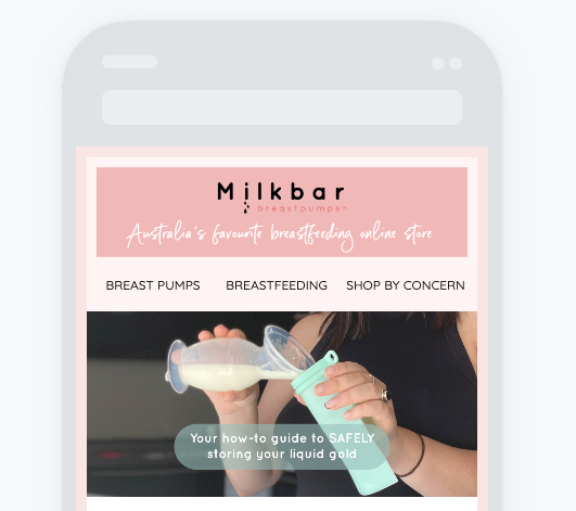
And this is the mobile version where you can see the unwanted padding.


Any help is greatly appreciated!

Hmm, not sure what’s going on there.  Tried it on my end and it worked on mine.  Could you send me a preview email? manny@campaignsandflows.com


Hello,


I have the same problem. Was this issue resolved?


Thank you!


Chiming in here - our organization is also experiencing the same issue. Any way to pinpoint a fix? 


Anyone? I have this issue as well… Super annoying.


Update for anyone interested in a workaround. Use an image container first for an actual logo bar - use a background for it and a specific render size you want with appropriate paddings/etc. then put a header bar underneath that with whatever links you want to use. The image container won’t add additional padding on mobile like the image within the header bar content section does. Rather simple workaround, ha. 


Thanks! Great workaround 🙂 I don’t get the part with adding the header bar underneath though. 


Add an image - insert your logo bar.
Then add the “header bar” content piece and just don’t put a logo into it. 


Reply