Solved

How do I put two buttons side by side in an email?

  • 9 October 2021
  • 5 replies
  • 7209 views

  • Anonymous
  • 0 replies


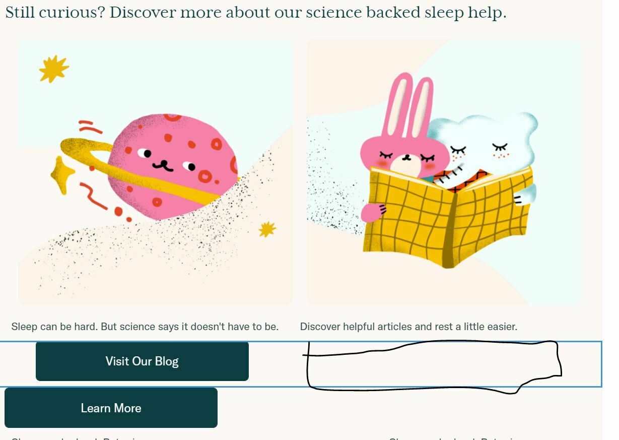
How do I get both buttons to be side by side


icon

Best answer by Taylor Tarpley 12 October 2021, 16:27

View original

5 replies

Userlevel 7
Badge +38

Good question.  Curious, how did you get the images above that to be side by side?


I would say the way to do it is by using columns.  You can find the setting to add colulmns in the Blocks on the bottom right:

Also, I’m curious based on the email content, what is your site?

Userlevel 7
Badge +60

Hi @Madmike


Thanks for asking your question in the Community! 


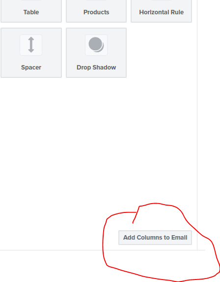
In order to insert buttons that would appear side-by-side under each picture, I would follow @Mailbox Manny’s awesome advice to add columns to the designated place you want to insert these buttons. Once you click to add to the Add Columns to Email’ option, it will ask you what many columns you want to insert with various options of how those columns can be formatted. You have the option of adding up to four columns to the width of your email. After inserting two columns the same size, you can insert a button block directly under each text block then deleted the text block if you do not need it.


Additionally, I would suggest checking out our Academy course on Email Design and this Community Post on further insight into adding columns to an email! 


Thanks for being a part of the Community! 


-Taylor 

Badge +2

Hi,


Thanks for the thread, very useful! 


One question I have is on mobile screens. It seems like the 2, 3 or 4 columns block inserted via ‘Add Columns to Email’ works on Desktop only? 4 columns would obviosuly be an overkill on mobile, but I’m thinkgin on the 2 columns option. Is there any way to make it work?


Cheers, Ramon

Userlevel 7
Badge +60

Hi @ramoncassel,


Thank you for sharing your question with us! 


Yes, that is correct! The button ‘Mobile Optimization’ is toggled on automatically on your template, which helps you to view what your template might look like on mobile and therefore will only show those columns stacked on top of each other, as is considered best for mobile display. However, you can toggle off the Mobile Optimization button under the Styles > Mobile section of your template. 


I would recommend sending a test email to yourself and viewing it on your phone to see how it will render as testing this way is the most accurate know how it will look in your customer’s inboxes. Explained in a similar community topic linked below.


Thanks for participating in the Community! 

-Taylor 

Badge +2

Hi @ramoncassel,


Thank you for sharing your question with us! 


Yes, that is correct! The button ‘Mobile Optimization’ is toggled on automatically on your template, which helps you to view what your template might look like on mobile and therefore will only show those columns stacked on top of each other, as is considered best for mobile display. However, you can toggle off the Mobile Optimization button under the Styles > Mobile section of your template. 


I would recommend sending a test email to yourself and viewing it on your phone to see how it will render as testing this way is the most accurate know how it will look in your customer’s inboxes. Explained in a similar community topic linked below.


Thanks for participating in the Community! 

-Taylor 

Brilliant, thank you!


Reply