Hi @vperreault,
Thanks for sharing this with the Community.
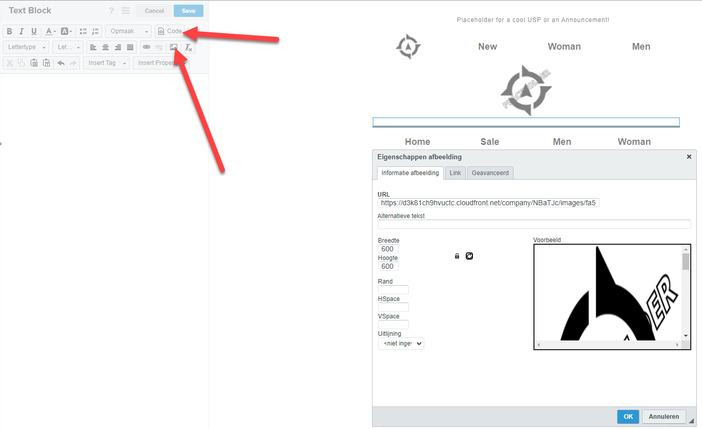
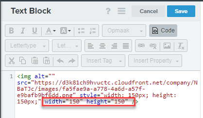
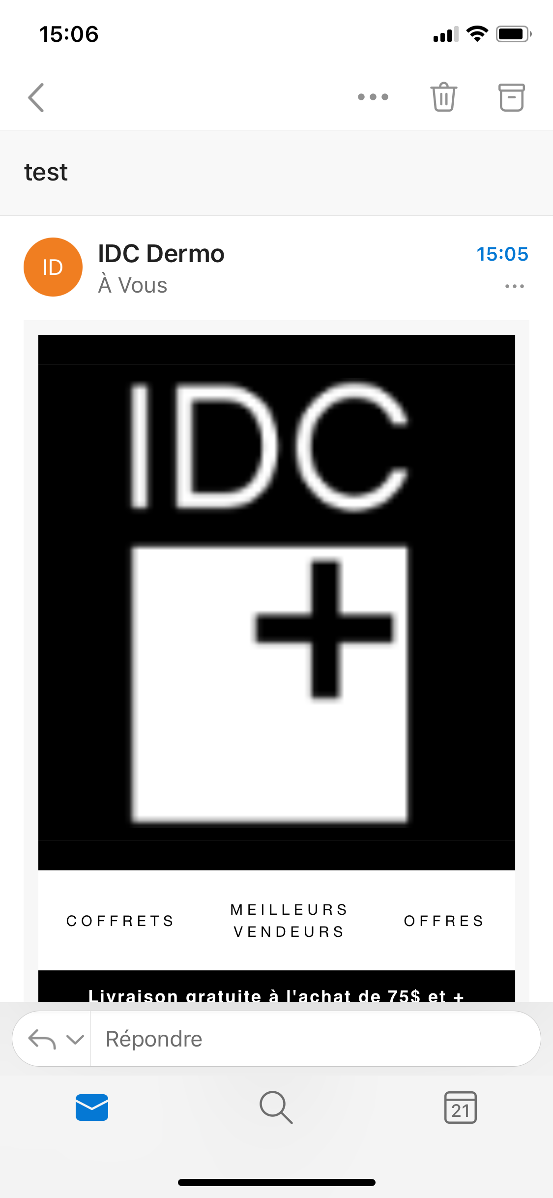
First, can you confirm that the preview and the live email are both being viewed on mobile? If the preview is not being viewed on mobile but the live test is, I recommend navigating to the header block and checking to see if there is a mobile only version of this block with a larger logo size. If so, you can adjust this directly in the mobile view of the template, then try sending another live email.
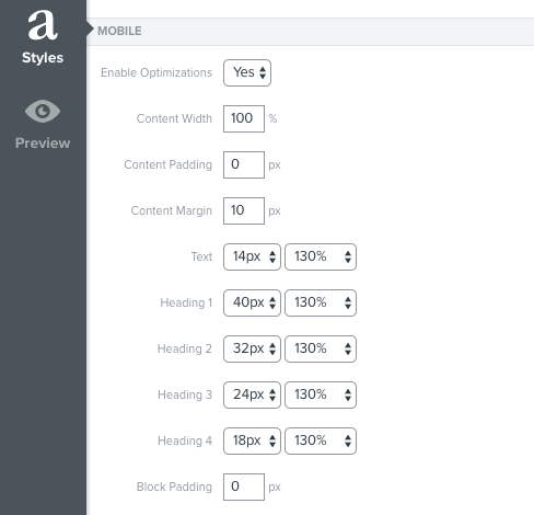
Additionally, we recommend keeping your total message width to 600px so we're able to optimize it for mobile. Under the Styles tab you’ll find Klaviyo’s default settings for mobile optimization. I am including more information on mobile optimization for your emails here.
Also, when you say you sent it, were you viewing the email in a thread, forwarded, or within Outlook?
When emails are within an expanded thread, they are technically being forwarded, when an email is forwarded, this cause the HTML to render twice, and can cause style issues - such as showing desktop only blocks on mobile or changing set widths. If the error is occurring when inside a thread/forwarded, then it is expected behavior to have style discrepancies, and we cannot avoid this within Klaviyo.
Lastly, I would try removing the logo entirely, re-sizing the logo image to a smaller size and re-uploading it into a header block, mobile only view and try sending another live email.


![[Academy] Deliverability Certificate Forum|alt.badge.img](https://uploads-us-west-2.insided.com/klaviyo-en/attachment/505f2253-cde5-4365-98fd-9d894328b3e0_thumb.png)


