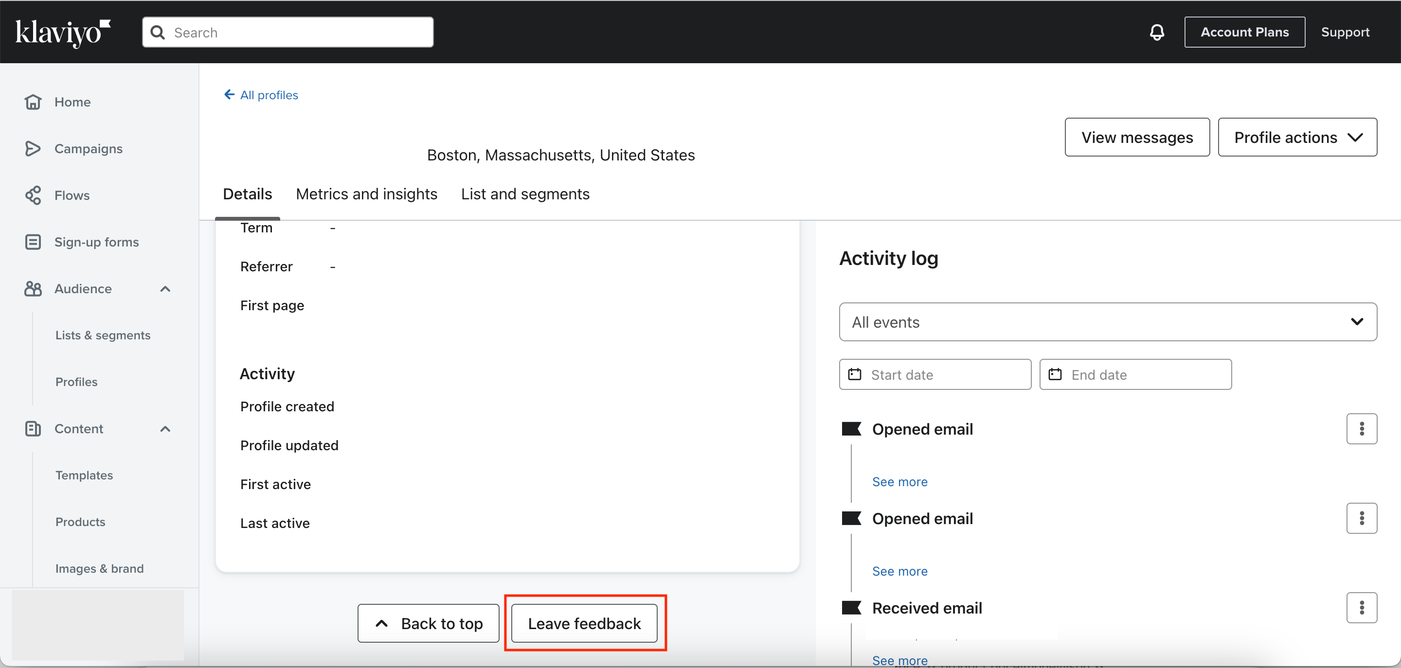
Hello, I know it’s been there for quite a while now, but I just can’t get used to the new customer profile dashboard, I really miss the old one and being able to see everything at a glance (where they signed up/how many orders/ which lists they’re in! I know you can switch over to the old view for a while longer but that will be gone soon. Is anyone else struggling with it?
New profile view
Log in to the Community
Use your Klaviyo credentials
Log in with Klaviyo
Use your Klaviyo credentials
Log in with KlaviyoEnter your E-mail address. We'll send you an e-mail with instructions to reset your password.


![[Academy] SMS Strategy Certificate Forum|alt.badge.img](https://uploads-us-west-2.insided.com/klaviyo-en/attachment/2f867798-26d9-45fd-ada7-3e4271dcb460_thumb.png)


