Recap discussion [Strategy session] Design Emails that Convert
This post contains all resources related to our recurring live training [Strategy session] Design Emails that Convert. You can register to attend the next session here, or watch the recording of the latest session below.
Session recording
In this session, we:
Debunked common email design myths
Reviewed the 6 commandments of effective email design
Had a walkthrough of Klaviyo’s email template editor
Discussed how to measure success and optimize your email design
Can you point me to examples of templates for different types of emails. For example, the template for a promotional email or weekly email would be different from a template for a flow email.
Thanks, Jan.
Hi @jjaworsky, you can find some really good examples from real brands here (with the possibility to filter by categories): https://reallygoodemails.com/
I created a template but everytime I add an image, it changes it size. How do I keep my image consistent in the email?
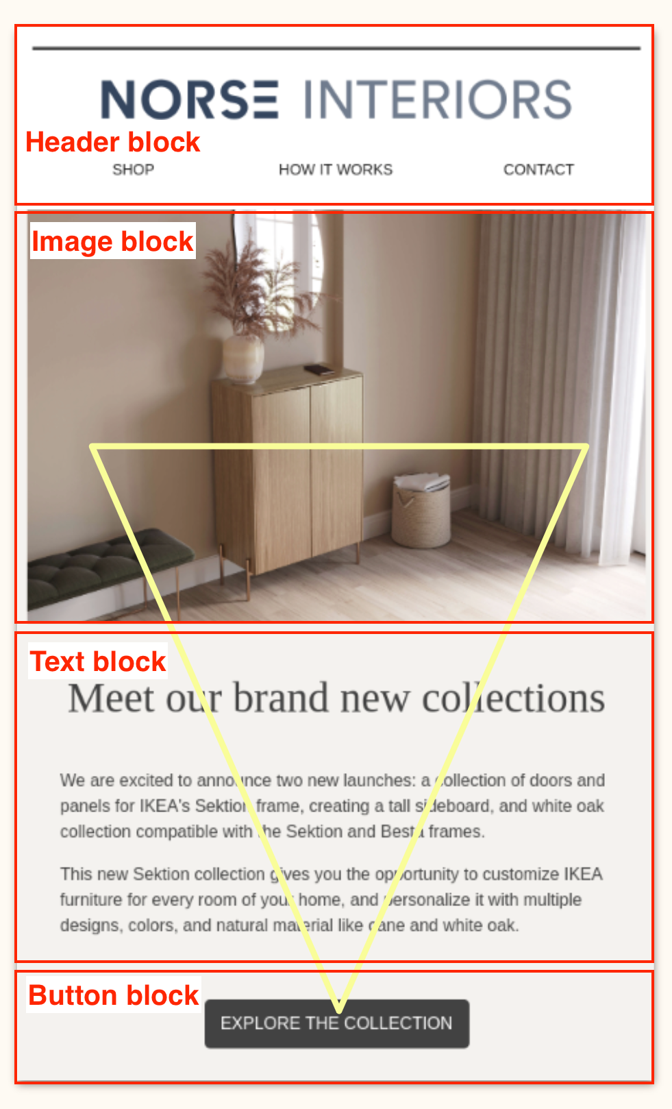
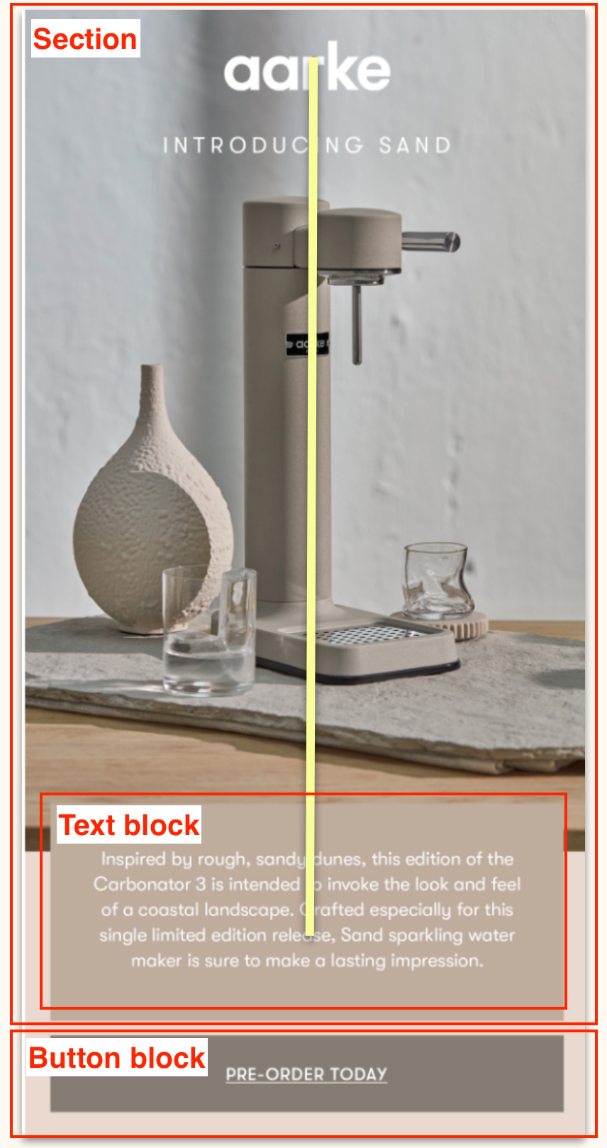
I think it’s interesting that all the examples shown at the beginning of the webinar from other brands looked like they were all just image-based emails. I keep having conversations with different ESPs as well as different Klaviyo employees about improving our deliverability rates and email KPIs, and I keep getting told to start making emails with HTML or within Klaviyo with a mix of text blocks and images. Currently our emails are all images with text right on the image, and we upload these images into Klaviyo - no editing required in Klaviyo. However, the examples that I keep being shown about ideal templates all look like image based emails. For example, the Aarke example of the single column template absolutely does not look like it was made in Klaviyo. And neither did the inverted triangle example either.
Can you guys please clarify why you are using examples for ideal templates that are clearly not made in Klaviyo editor? Where are examples of clean, beautiful, engaging emails that are made within editor? Sure the email for the fake coffee company that you created looked fine enough, but nowhere near the streamline design and aesthetics of the examples shown at the beginning of the webinar.
What is your advice here? How can we create actually beautiful emails within Klaviyo editor to improve deliverability? Or what can Klaviyo do to support brands who use image-based emails? Please advise.
Hello @Jenessa,
Welcome to the Klaviyo Community!
Although image only emails may look appealing, it’s typically not recommended for a variety of reasons. One of the main reasons being, that inbox providers can’t “see” and understand images when crawling them for potential malicious content. Both Litmus and Email on Acid actually have great blog article on this topic:
Those ideal templates for both the inverted pyramid and single column can certainly be created within Klaviyo’s native drag-and-drop editor. For example, the inverted pyramid can be created by stacking a header block, image block, text block, and finally a button block all on top of one another.
Similarly, the single column example is even simpler. It’s actually only a section with a background and a text block layered on top followed by a button block.
When gathering inspiration from other brands and analyzing how their emails are designed, I tend to find it helpful to break down the emails into smaller sections and groupings. Personally, I’ve seen a number of extraordinary templates made directly from within Klaviyo’s editor. It’s really all a matter of how you personally design the email in the format you want.
Although image only emails aren’t recommended, one suggest to help gain trust with inbox providers and help with deliverability is to include alt-texts to the images. In fact, including alt-texts to images is highlight recommended - even for non-image only emails and is considered best practice.
Ultimately, content plays a small part in your brand’s deliverability. Alt-texts will help inbox providers understand some of the content you’re sending, but not to the full extent as a mix of images and text blocks would.
If you need more hands on assistance, I would encourage you to reach out to some of our wonderful Klaviyo Partners that specialize in email design. I know from experience that a number of them have helped others in a similar situation recreate templates within Klaviyo. You can find our Partners through our Klaviyo Partner Directory.
My colleague @stephen.trumble has also previously shared some great template examples in our periodic showcase which I’ve included below that you mind find helpful to review as well:
Thanks for being a part of the Klaviyo Community!
David
Hi, Thanks for the session, some very useful tips and strategies. I just have a couple of questions. When doing an A/B Test, what is best practice for the split/percentage that you would send to group A vs group B? And also, can you provide further information on what open, click and conversion rates you should aim for when sending out a campaign.
Hey @Neva,
Great questions!
When it comes to best practice for determining the percentage you want to split test your campaigns, this would really be dependant on your list/audience size. For example, if you are sending to a larger audience, you may be able to use smaller percentage of users for testing. Whereas, if you have a smaller audience group, you’ll want to use a larger testing pool.
The key here though is determining significance in your test. This means ensuring there is a large enough testing pool to help determine a winning variation.
When sending out campaigns, I always suggest using both the benchmark tool and our Getting started with email deliverability monitoring and performance metrics guide to help determine what open, click, and conversion rates you should be aiming for. It’s important to note that each industry has different benchmarks that could change over time. But a good rule of thumb is aiming for an average open rate of 52.49% and a click rate of 5.83%.
David
Hi there!
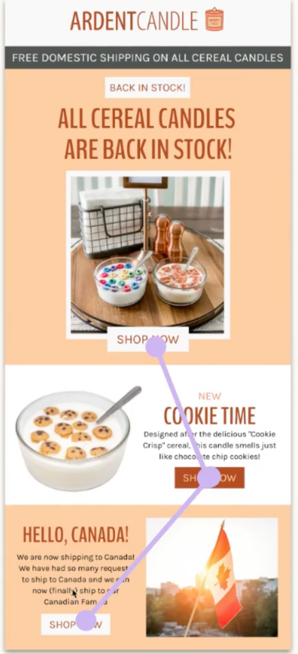
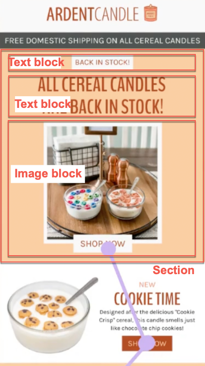
Can anyone tell me how to add buttons to sections like in this example? I want to add buttons to one side of the split section but struggling to do so. Your help is appreciated!
Hi @PlasticsFree_Lily ,
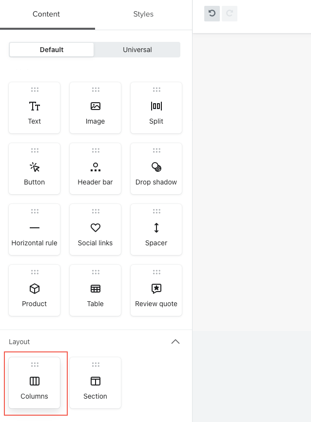
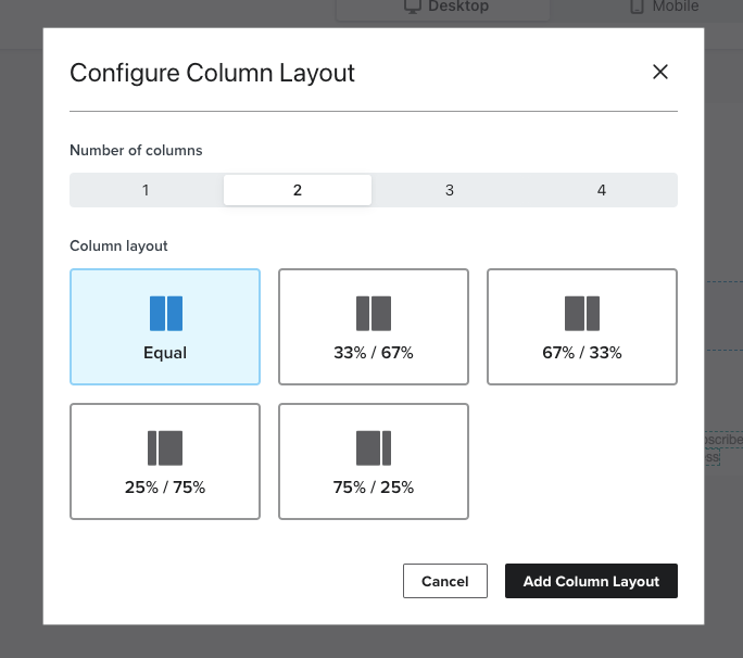
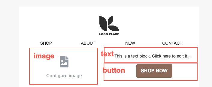
To replicate this you want to first drag in a Columns block.
Then add an image block to the first column, and a text + button blocks to second column like so.
Hope this helps!
Thanks Mai, that’s very helpful - how do you make it so that they overlap each other like in the screenshot?
Are you referring to the first section with the cereal candles? I believe they created an image with the button and photo overlapped and then uploaded that as an image block.
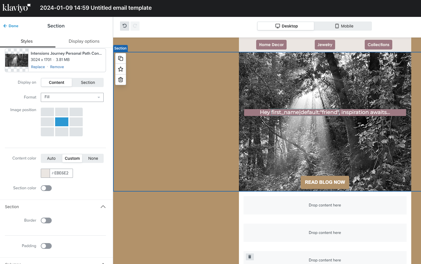
Helloooo… I’m new to sections and I’ve added them in a template with an image, also added text, however I’m having a hard time figuring out how to add the button to this section… When I try to place the button, it naturally wanted to go just below or above? After playing with it I actually figured it out somehow (not sure how I made it happen lol), but I’m unable to place the button higher up on the photo. It’s too close to the bottom and unbalanced. Any advice? :)
Hello again, can anyone help me? :)
Hi @JesterSwink !
I made a little screen recording for you:
Hope that’s helpful!
Cheers
Oh my gosh, Mai, thank you sooooo much for clearing that up. :) I didn’t catch that portion on the call, so this really helped. Much thx, I really apreciate it. It was so valuable to learn how to create better emails right in Klaviyo - love you guys!
Cheers, Rae
www.JesterSwink.com
@JesterSwink so glad I could help Rae! Don’t hesitate to let us know if you have any other questions in the future :)
Appreciate it! :)
Hey Team! Great training yesterday! Is there any chance we can get the chat/q&a transcript from yesterday? I asked a couple off questions that were answered but I didn’t actually get a chance to read the answers properly! Thanks
@kasey thanks so much for following up and glad to hear you enjoyed the training session. Unfortunately at this time chat/ q&a transcripts are not available. Thank you for your understanding.
Is it best practices to import pre-designed images to a majority of sections in klaviyo? and adding links to those image sections?
Hi @davidcairy, you can definitely add pre-designed images to your email templates in Klaviyo, but it is not best practice to have templates that consist only of images (aka image-only emails) because they can hurt your email deliverability.
To assess whether an email is spam, inbox providers (Gmail, Yahoo, etc.) crawl through the email to look for spammy content. Unfortunately, inbox providers cannot “read” any text present in images. This means they’re unable to assess the content of image-only emails, and for safety reasons they might place them in the spam folder. It’s actually really common for spammers to use image-only emails to try to trick inbox providers from blocking them.
Advice on this may vary, but it is best practice to have a 60:40 text vs image ratio. And if for some reason you decide to go forward with an image-only email, do make sure to add alt-text to your images so there’s at least some sort of text description that inbox providers can “read”.