Solved

Popup design: different 'email input' block for mobile vs desktop?

  • August 29, 2025
  • 1 reply
  • 34 views

Forum|alt.badge.img

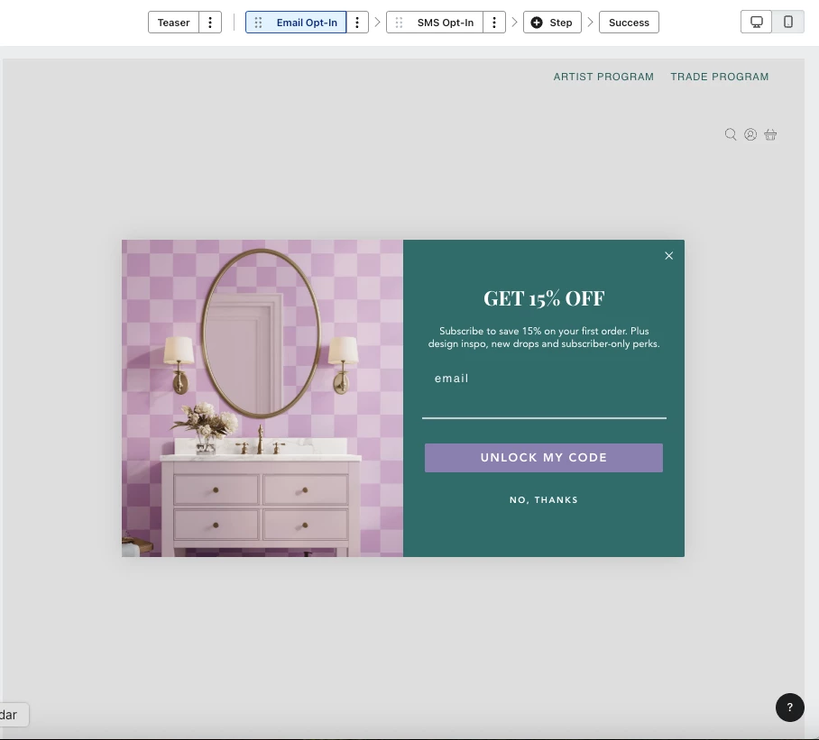
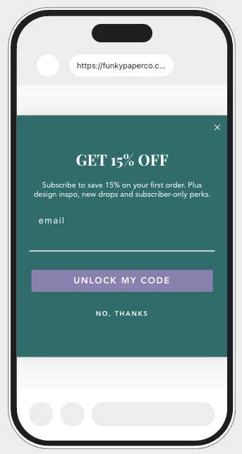
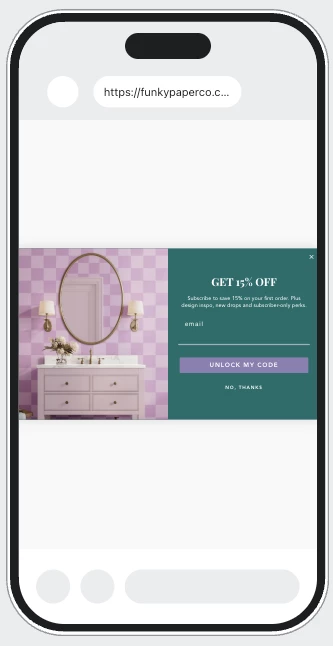
Hello! I have setup a welcome email & SMS popup. I like the way it displays on desktop (with left image) and the ‘email input’ block on the right. However, on mobile it reads small if I keep the left image. And if I make the left image desktop only, the mobile design looks plain. 

Ideally, on mobile I’m looking to do: the no side image layout with a background image (and a color overlay at around 90% opacity) without effecting the popup design on desktop -- similar to how it’s done in email templates / campaigns. 


Is this possible without creating separate popup forms? I can’t find a way to touch the left side ‘email input’ block (in solid green here) on mobile only. Not sure if there is a feature I’m missing. Tyia!


Best answer by danielmonty

Hello!


It’s not possible to edit individual elements per device within a single form. To get the layout you want, you’ll need to duplicate the popup. Style one version for desktop and another for mobile, then in the form editor go to Targeting > Behaviours > Devices. Set one to Desktop only and the other to Mobile only. This way you can keep your desktop design as-is while using a background image with overlay on mobile.

1 reply

danielmonty
Partner - Silver
Forum|alt.badge.img+5
  • Partner - Silver
  • 10 replies
  • Answer
  • August 29, 2025

Hello!


It’s not possible to edit individual elements per device within a single form. To get the layout you want, you’ll need to duplicate the popup. Style one version for desktop and another for mobile, then in the form editor go to Targeting > Behaviours > Devices. Set one to Desktop only and the other to Mobile only. This way you can keep your desktop design as-is while using a background image with overlay on mobile.