Hi, 

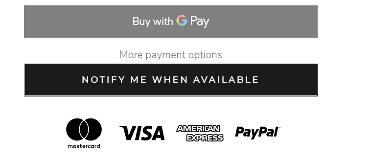
I have added the back in stock button to my site and customised it to fit my theme, but I need to add a little bit of space above the button as it’s too close to “more payment options”. 

Does anybody know how to do this please? 

It’s the Prestige theme if that information is needed - screenshot below.


Thanks in advance!

I worked it out myself. For anyone who has a similar issue in the future, add the following code to your theme.css 

a.klaviyo-bis-trigger {
    margin-top: 15px !important;
}


Hey @StirlingKlav,

So glad you were able to find a solution and thank you for sharing it with the Community! I’m sure this will help other Community members who may be wondering the same thing!

Thanks for being a part of the Klaviyo Community!

David


Hi @StirlingKlav

Can you share your JavaScript snippet of customizing the button to fit your theme? I am using the warehouse theme also from Maestrooo, and I found the JavaScript snippet that provided by klaviyo cannot show as button. 


Thank you! 


Reply