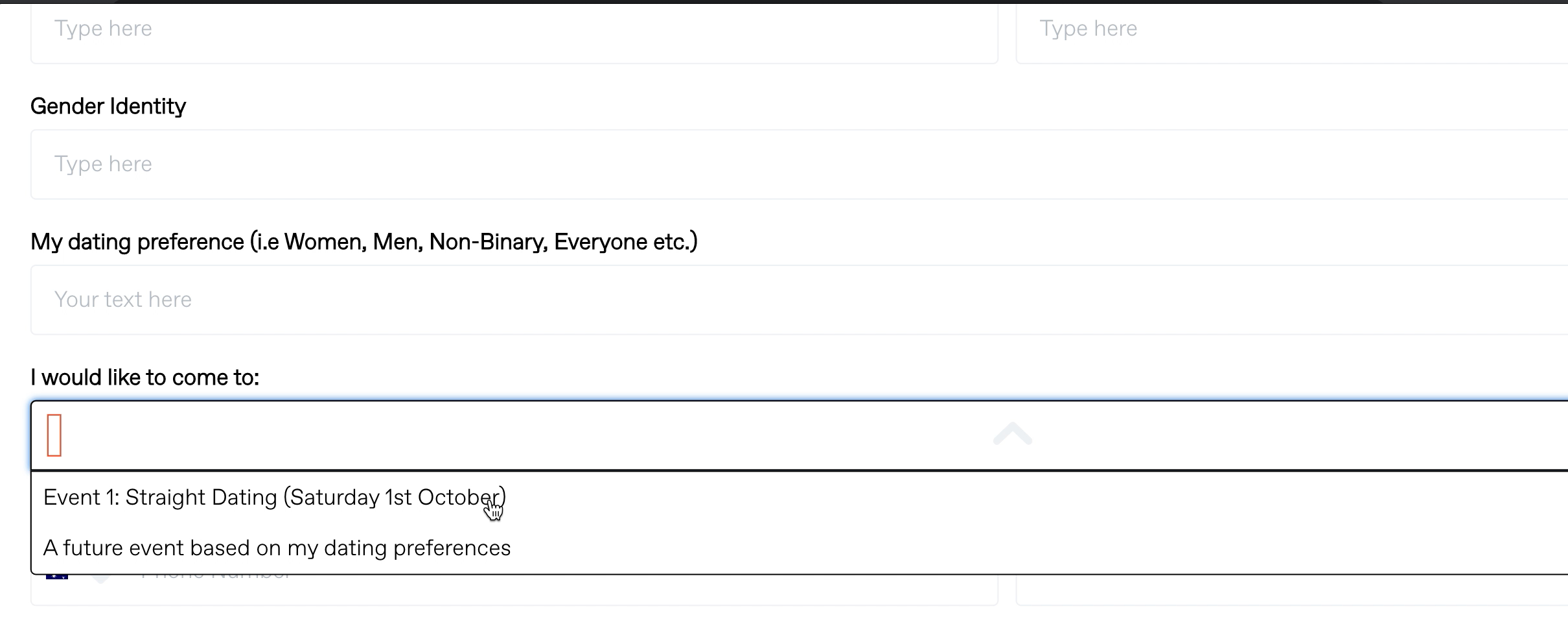
Hi there, I have recently built a sign-up form and embedded the link on my Shopify website.
I have a drop down menu and when the users click on their option, the selected option is not clearly visible and I’m afraid this will cause confusion. The same thing occurs for the check box option - a large black dot appears on selection, but again, it’s not clear to the use which option has been checked.
I have attached screenshots below.
Can anyone please assist?
Thank you!
Drop down menu option:

Check box option:


