We just set up a Sign up form on woocommerce with the “X” it set up so back ground in White but when we publish it seems to inherit our website CSS so the X is not matching the design you can see it on www.woodtowater.co.uk any help would be great please to make it white
Page 1 / 1
Hi there @Woodtowater,
Welcome to the Community! Happy to help!
Good job already investigating that your website’s CSS might be the issue! Yes, . I would ask your developer to investigate the backend of your site to look for !important tags in your CSS and remove these to rectify the issue!
Thanks for participating in the Community!
-Taylor
Hi @Woodtowater Just adding to @Taylor Tarpley.
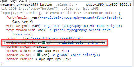
It looks like this Elementor global CSS below is adding the background as green to the close ‘x’. Hopefully that should help your dev.
Regards
Andy
Removing as shown gives:
I have seen so many of these posts and I have the same issue. It would be so much better if Klaviyo gave a solution not tell us to contact our developer. We are the developers of our sites, why are you making a product that isn’t user friendly?
Hi there @bellemode,
Thanks for your feedback!
When situations call for very specific custom troubleshooting, this isn’t something Klaviyo can support as each is very unique to each business! If you are a developer yourself, I’d recommend checking out our dev portal or sharing more high level developer related questions in our developer group!