I’ve created an embedded sign up form for my Shopify site.
The desktop view is fine but doesn’t look good on mobile as the boxes are too small.
So I created another form for mobile view, and stacked the boxes. I’ve copied both codes into my html box, but when I preview in mobile, the desktop form is showing.
Is this because
I haven’t puiblished the theme yet
I’m previewing mobile view on a desktop
I’ve done something wrong
This is my custom html
<p>Enter your email to go into our monthly draw.</p> <p>Don't worry, our dogs don't get spam and neither will you</p> <p></p><div class="klaviyo-form-Wr5QWY"></div><p></p><p></p><div class="klaviyo-form-R4iziZ"></div><p></p>
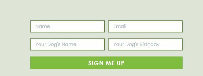
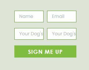
desktop viewmobile viewmobile form in Klaviyo (ignore the image behind, also using on landing page which is also not displaying stacked on mobile
Thank you for any help - given nearly 80% of my traffic is on mobile, the form needs to render correctly - it seems crazy that we have to even create separate mobile forms now.
Best answer by Omar
@Bonza Dog Treats Not sure if this helps but some troubleshooting things I'd probably look at
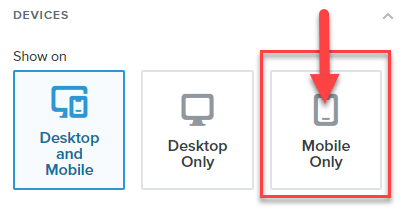
Make sure both forms are selected to display for only desktop or mobile
For the Mobile view make sure you've changed the settings and test with 100% width
For troubleshooting purposes I'd recommend only try testing with the mobile form html codes first making sure it's displaying before adding the desktop version. (make sure you targetting is mobile only - see screenshot below)
Make sure you're adding the code in the html view of the editor
Use developer tools (if you're handy) to check if nothing is overruling the styling
As for the HTML i'd remove all the <p></p> so this:
@Bonza Dog Treats Not sure if this helps but some troubleshooting things I'd probably look at
Make sure both forms are selected to display for only desktop or mobile
For the Mobile view make sure you've changed the settings and test with 100% width
For troubleshooting purposes I'd recommend only try testing with the mobile form html codes first making sure it's displaying before adding the desktop version. (make sure you targetting is mobile only - see screenshot below)
Make sure you're adding the code in the html view of the editor
Use developer tools (if you're handy) to check if nothing is overruling the styling
As for the HTML i'd remove all the <p></p> so this:
Thanks for sharing your question with us! Love your website!
Definitely understand wanting to fix this error if 80% of your business’s traffic is on mobile. While we can’t troubleshoot custom coding, I would recommend orienting your mobile view form to the left, and stacking only box on top of each other in one column to help with the display. Additionally, it’s typically best practice to only use an embed form for email signups. You could additionally ask for this added information in a popup or flyout form that wouldn’t have the issue or width or room and are the options more users use to collect additional properties about a user like their dog’s name and birthday. You could also ask for this additional information in an email vs a form.
However, if you still want to obtain this data in an embed from through custom coding, I would reach out to an awesome Klaviyo Partner who would be more than happy to help work with you to find a solution!
Thanks for your help - I did have the devices set up correctly. Maybe the extra code in the html was a problem. I’ve just tested it on my live site and now stacking correctly on mobile. Hopefully when I publish the new theme it will also render correctly there. Appreciate your help.


