New text formatting


Forum|alt.badge.img+3

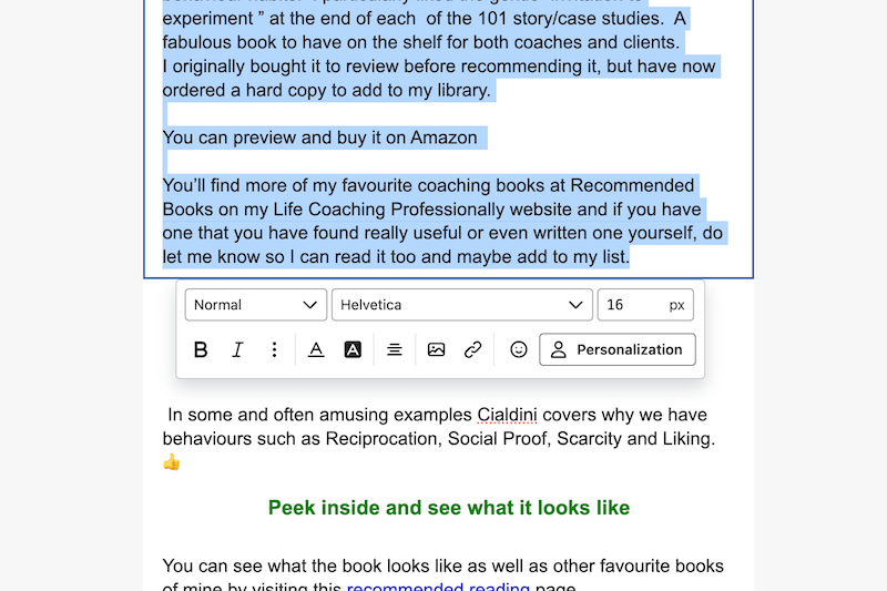
Am I the only one that finds the new position of the text formatting box absolutely maddening?  Why did it have to be moved from the side?.  I am finding the process of creating an email mind numbingly frustrating, so much that I have stopped what I am doing to write this.

How it is possible to edit an existing text without the newly positioned formatting box jumping all over the text I am trying to write? I honestly am this close to leaving Klaviyo especially after some of the other unfriendly changes...

Did this topic or the replies in the thread help you find an answer to your question?

2 replies

Forum|alt.badge.img+7
  • Klaviyo Employee
  • 169 replies
  • May 6, 2024

Hi, could you paste a screenshot of the editor you’re referring to? When editing text in campaign or flow emails?


Forum|alt.badge.img+3
  • Author
  • Contributor IV
  • 9 replies
  • May 7, 2024

Thank you saulblum, I am very happy to provide it.

I was working in Campaigns.  Coming back to it today, for whatever reason the process is working better (maybe it’s me) although I am still at a loss why you would make such a change.  Despite the slightly better experience it is still frustrating.

If Klaviyo is committed to it, which I presume you are, at least make the formatting interface moveable and fixable in a location of my choice so I have control over it’s location to suit my needs  and I know where it will always be.  That is, intuitive for me!

In summary - I HAVE to double click text to have access to text.  I can’t just highlight a sentence to delete or alter it. 

Moving the cursor, the interface can also just disappear until I double click. 

If I want to copy text from one area to another, immediately adjacent, it potentially hides the other text region.  

I can also often can run my cursor over it and it shifts location. Its like it is dodging around while I try and locate it!

The photo shows me one of the more maddening experiences when it sits over a headline.  I know I have to click outside the area to clear it but it’s a poor UX. 

Hope this is clear.  I will provide a video if you need more but, in the end, giving me some level of control of its location and stability will solve everything.