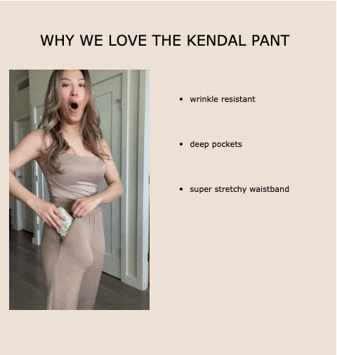
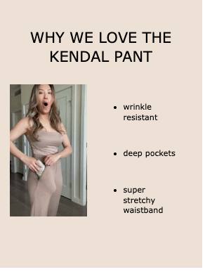
Hey! Okay, so I have a GIF embedded in my email and I want the text to look as it does for mobile on desktop (more aligned and all). How do I get it to look aligned on desktop and mobile. Thank you!

Hey @Vbeebs 

Welcome back to the community! Can you provide some screenshot of what you have designed so far and more info on how you’d actually like it too look? What text are you trying to optimize? Knowing how you have it set up will help me figure out what you should update or change. 

I’ll be on the lookout for your response!


yes! I meant to attach screenshots —whoops! 

I want it to look more like the second photo where everything looks more proportionate. Currently using a table block to accomplish the side by side on mobile and desktop.


@stephen.trumble waiting to hear back from ya! :) 


Hey @Vbeebs 

Welcome back to the community! Can you provide some screenshot of what you have designed so far and more info on how you’d actually like it too look? What text are you trying to optimize? Knowing how you have it set up will help me figure out what you should update or change. 

I’ll be on the lookout for your response!

hey! Just following up!


Hey @Vbeebs 

Thank you for your patience, as I was out of office.

So the easiest way to achieve this on the desktop format would be to adjust the text sizing. If you haven't already, I would create two different blocks, one for mobile and another for desktop display only. Then optimize the text sizing for the desktop only version until you achieve a similar result. With drastic sizing differences between mobile and desktop screens, it is often best to create two variations as the desktop display will have a lot more width to try to fill.


Hey @Vbeebs 

Thank you for your patience, as I was out of office.

So the easiest way to achieve this on the desktop format would be to adjust the text sizing. If you haven't already, I would create two different blocks, one for mobile and another for desktop display only. Then optimize the text sizing for the desktop only version until you achieve a similar result. With drastic sizing differences between mobile and desktop screens, it is often best to create two variations as the desktop display will a lot more width to try to fill.

oh wow I did not know i could do that! oh my gosh — you’ve changed  my life haha thank you!


Hey @Vbeebs 

HAHA, I’m so glad to have made an impact and happy to help! Looking forwarding to seeing you again in the community!


Reply