Solved

How to get iPads to display the full width of a template?

  • 29 October 2023
  • 2 replies
  • 47 views

Userlevel 3
Badge +5
  • Problem Solver I
  • 35 replies

Hi There,

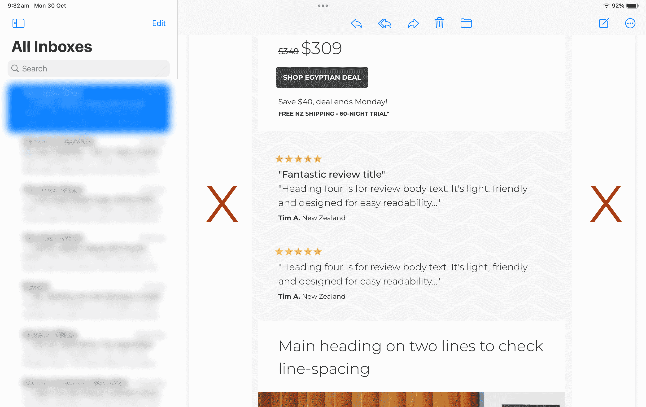
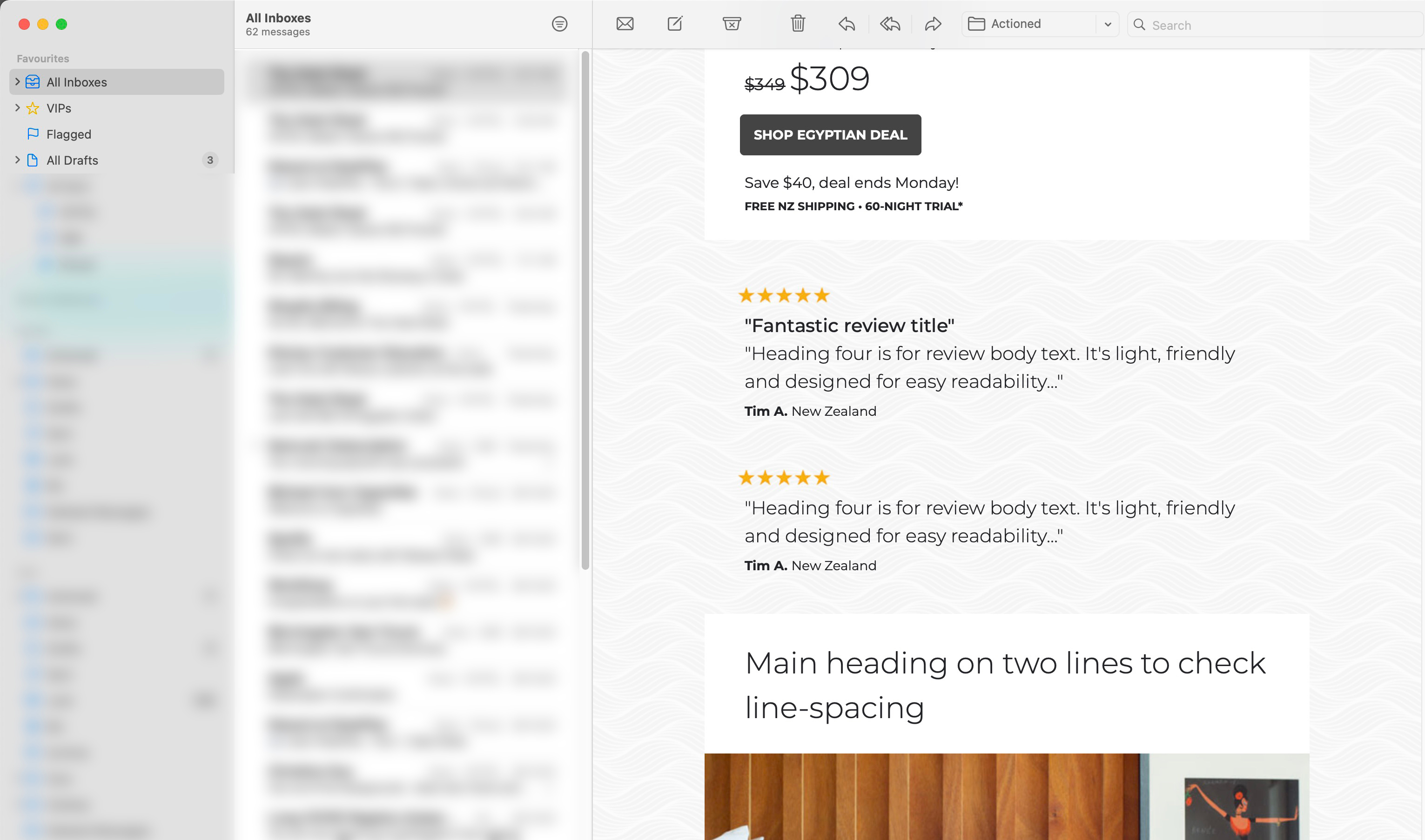
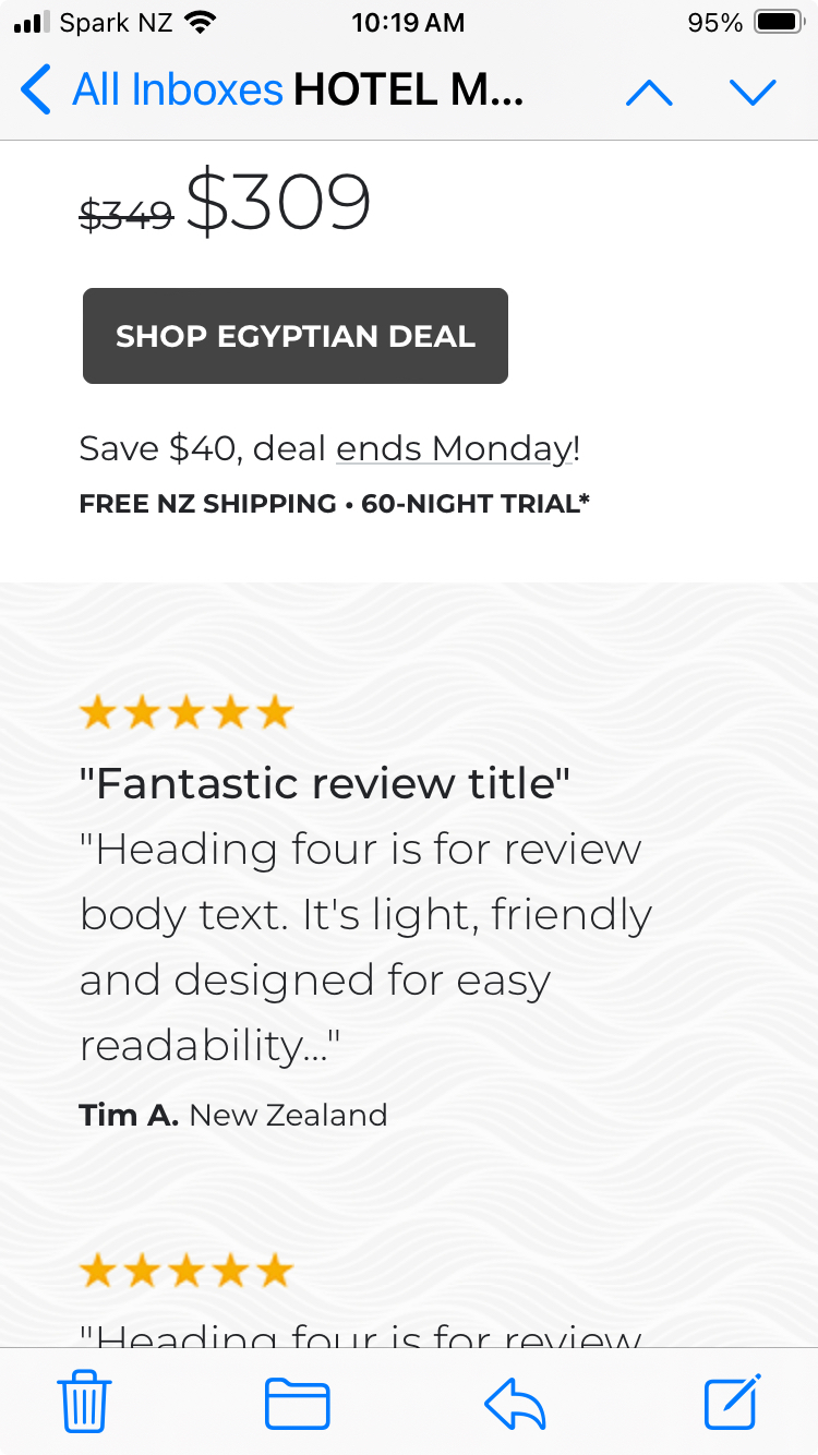
Desktop and mobile templates look great but I can’t get iPads to display the full-width of the email background, even though there’s plenty of room - see attached for iPad (see red X’s) vs Desktop vs Mobile.

Mobile doesn’t have this issue because the design butts to the sides so you don’t get that 15px each side which creates visual clutter between email and content backgrounds if that makes sense. It looks super clean when viewing on the device.

Does anyone know how to stop iPads from cutting-off backgrounds on the sides?

Any help much appreciated.

Cheers, Ben


On iPad...


On Desktop…


On Mobile…


icon

Best answer by Taylor Tarpley 30 October 2023, 21:39

View original

2 replies

Userlevel 7
Badge +60

Hi @Ben


Great question!


Tablets are always tricky! Unfortunately, there is not way to prioritize what version of an email, desktop or mobile, an IPAD will display.


While I wish there was some way to alter this, ultimately, this is not something we can control in Klaviyo as the issue lies with how IPAD renders emails. 


Thanks for participating in the Community!

-Taylor 

Userlevel 3
Badge +5

Thanks Taylor, much appreciated.

Reply