Solved

New Editor: Inconsistent left/right padding between different blocks on mobile

  • 10 March 2022
  • 7 replies
  • 1100 views

Userlevel 3
Badge +5
  • Problem Solver I
  • 35 replies

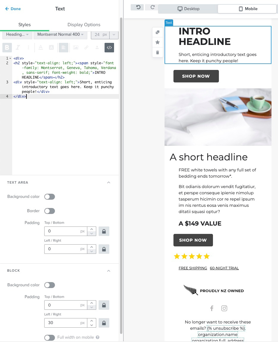
Hi There, new to Klaviyo so sorry if this basic.

We’re having trouble getting elements to line-up on the left edge on Mobile. No matter what combination of element or block padding we apply, stuff doesn’t seem to line-up in the new editor.

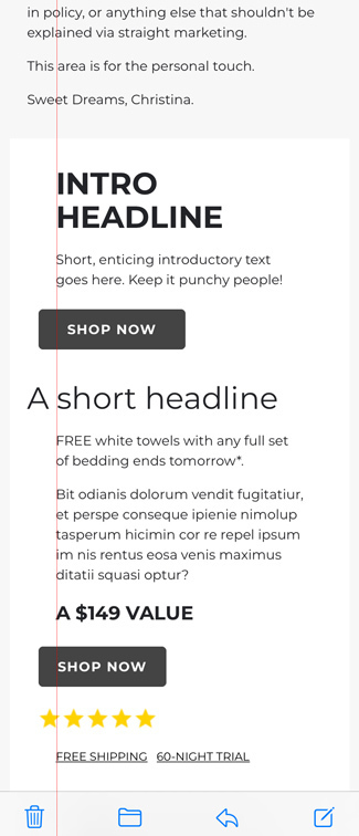
Example #1 - Block-level Padding

Because block padding is available everywhere, if we standardise settings and only use block padding, we get inconsistent margins on mobile.

See the red line, the text, button and stars image all have 30px block-level padding and 0px element padding but nothing lines-up on mobile...


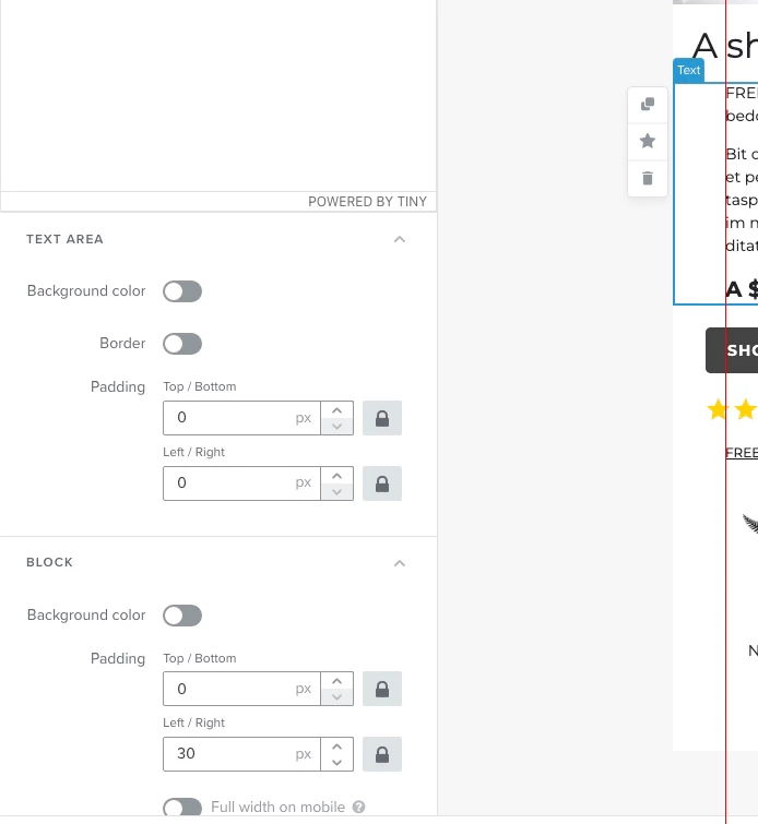
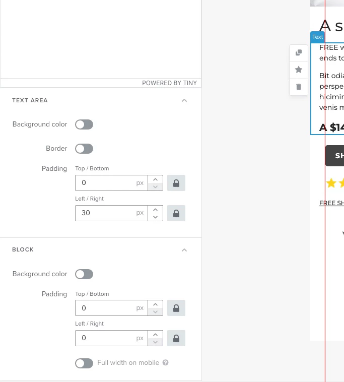
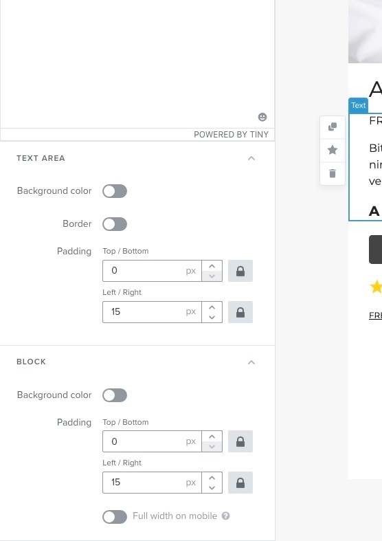
Example #2 - Element-level Padding

But if we try to use 30px of element padding instead (not available on images or buttons) the text also doesn’t line-up on mobile…


Not 100% sure what we’re doing wrong, have logged-out and back in but no joy. Do others see this or is it just us?

Cheers, Ben

icon

Best answer by Ben 24 March 2022, 21:18

View original

7 replies

Userlevel 7
Badge +60

Hello @Ben,

Interest case you have!

Out of curiosity, what type of block is the one with the stars using? 

One thing that comes to mind is if those stars are coded into a text block via HTML. In which case, I would wonder if there were any additional formatting in the HTML that may be causing this experience. Ones that come to mind would be if those stars were populated from Stamped.io or Yotpo. 

David


Userlevel 3
Badge +5

Thanks @David To,

The stars are just a png file. So the blocks you see (top to bottom) are:

  • Text block (headline)
  • Text block (text)
  • Button block (button)
  • Image block (stars)
  • Text block (links)

Hope that helps diagnose the issue. One thing we haven’t tried is sending a test and viewing it on a phone - the screenshots are obviously from the editor. Will test now and report back.

Cheers, Ben

Userlevel 3
Badge +5

@David To,

Same thing when viewing on an iPhone (iOS 15.1) so assume the new editor is correctly previewing emails - see attached, screenshot is from iOS Apple Mail (red line added after)…


Padding settings for each item on the white background…

  1. Intro Headline & Text = Block Padding 30px
  2. Button = Block Padding 30px
  3. A Short Headline = Text Padding 30px (no block padding)
  4. Text = Block Padding 30px
  5. Button = Block Padding 30px
  6. Stars Image = Block Padding 30px
  7. Free Shipping = Block Padding 30px

We’d prefer to use block padding-only to keep the template easy to maintain/understand because some blocks don’t have item-level padding (like images and buttons).

HTML

As for HTML, we’ve haven’t added anything or copied/pasted content (it’s just a template at this stage) so assume the divs shown in the code are added as part of normal use? Will remove and test again.


Cheers, Ben

Userlevel 3
Badge +5

@David To,

Tried removing those divs but the preview didn’t change and when I went switched back from editing another block, the divs were back so assume they’re part of normal markup the editor creates?

Hope that makes sense, let me know if this is something we’re doing wrong - and please let us know if it’s a bug (and when it’s fixed) because it’s holding-up our migration from Campaign Monitor.

Cheers, Ben

Userlevel 7
Badge +60

Hey @Ben,

Thanks for sharing those additional details! 

This case got me a bit curious so I did some digging and testing in my own account along with reaching out to some of our Template team for more detail. 

For started, I can confirm that there is some slight bugginess going on with the padding effecting only the mobile view. It appears that on mobile, text blocks will inherently adopt some slight padding even when it was set to zero - which I did for my own testing. Although this doesn’t entirely break anything, I can understand the nuisance that this can cause. Our Template and Product team are aware of this issue and are working towards a resolution. 

Through my own testing, I’ve discovered that when viewed on mobile, the text block’s inherent padding adoption is roughly 15px. For your specific use case, this means that you should be able to reduce the existing 30px padding to 15px padding for those text block elements which will allow your text, button, and image blocks to align with each other better on mobile. 

I hope this helps! I’ll update this thread when I heard of any news on this behavior! 

David

Userlevel 3
Badge +5

@David To,

I can confirm that there is some slight bugginess going on with the padding effecting only the mobile view.

OK cool, we’re not going crazy!

Although this doesn’t entirely break anything, I can understand the nuisance that this can cause.

It’s definitely not a major technical bug but page margins are literally design 101, so from a design point of view, it’s up there.

For your specific use case, this means that you should be able to reduce the existing 30px padding to 15px padding for those text block elements which will allow your text, button, and image blocks to align with each other better on mobile.

Sweet, will work with this but hopefully it doesn’t languish in the bug list like design issues often do.

Cheers and thanks for reporting back, very much appreciated.

Ben

Userlevel 3
Badge +5

Marking this the best answer for future reference...

In order to get consistent left/right padding between image, button and text blocks, you have to split the total button/image padding, and apply half to the text area and half to the text block.

e.g. If you have 30px left/right padding on an image or button, to get text blocks to line-up across mobile and desktop, you have to split that 30px and apply 15px to the text area and 15px to the text block like this…

Not 100% sure why the text area has another set of left/right padding but if it’s so you can inset a text area (which is a good idea sometimes) it seems weird that the total padding has to be split between the two - right?

Reply