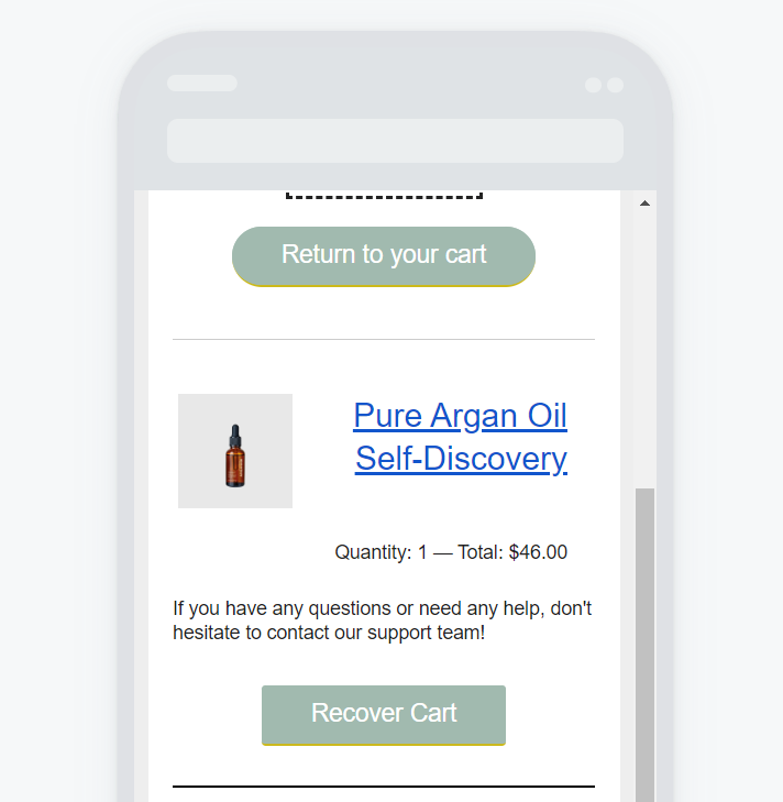
So, I’m very surprised that the Table element doesn’t have a function to allow stacking columns on mobile.


I’m trying to create a design where you have


image] [description]

]description] iimage]


And I’d like the description to move under the image when I am on mobile.

Currently, it’s really not looking great.
And adding a “mobile only” version table increases the size of the email and it ends up being clipped on Gmail.


The Split option doesn’t work for me as it’s not possible to vertically align the description text

And the column layout just adds useless bits of code + I need to add single columns on top of each 2-column I want to create to give more space and to add titles and description to my design.


Overall, I’m stuck between trying to create a mobile-friendly version of my email and good design :/

Now I understand more and more why most ecom brands are going for the “image” only emails as it makes it much easier to do whatever you want without risking to have emails ending up too heavy because of too many bits of code!


Any help would be appreciated!

Thanks

Hey @Jaybobo 

Im asking one of our product experts for a bit more information. My only thoughts would be to use the split block or columns but you’ve already said they don’t work for you. Once I get their response I will update you here! Thank you so much for your patience.


Hey @Jaybobo 

Thank you so much for your patience! After talking with our product experts I have a small update for you.

Aside from a Split block, the only other option would be to use columns, but then you run into the issue of the content not aligning so it takes a lot of playing around. Ultimately, your options are Table (but the items don't stack), Split where they do stack but they can't align the content vertically, or columns where they stack but they can't align vertically and they may run into alignment issues.  The only other options we could come up with are to use images, or custom code this block. While this isn’t anything new to what you have experienced, I hope this helps clarify the ability of each block for you to make the best choice for your marketing.

Hope this helps.


Hi @stephen.trumble

I also have the same issue, Is there a stack on mobile option to display table on rows not columns in mobile. look at the image, the product photo is crunshed.


Also looking for a solution to this. Would be solved by a display:block and width: 100% !important, but there’s nowhere to enter those custom properties...


Hi @PhilipL

I wanted to share this resource to use for building a custom-coded HTML Product Feed block in our guide on Extending Klaviyo’s Product Block Functionality from our Solution's Architects. 


Essentially, you will use a combination of Catalog Lookup Tags and Django Template Tagging to achieve your goals. Please let me know if you have any questions after taking a look through the linked guide. However, I believe it will provide you with all the information you need!

We only recommend using custom HTML for technically savvy marketers, or for anyone who has access to a developer. You can also check out our partner directory for partner assistance. I hope this helps!

~Chloe


I was facing this same issue and getting confused.

The “Split” block could stack in mobile - but could not add extra columns or rows.

The “Tables” could have extra columns and rows but only squish on mobile

I have found that using the “Columns” Layout allowed me to make 3 columns and insert a 3 row table into each of them so it now looks right for both desktop and stacks the way I wanted it to on mobile.

Hope this helps - thanks


I have found that using the “Columns” Layout allowed me to make 3 columns and insert a 3 row table into each of them so it now looks right for both desktop and stacks the way I wanted it to on mobile.

While I think that is fine for normal layouts, that would not work for dynamic tables. If you have two products with image in the left column and description in the right column, when it wraps you would get two images, then two descriptions – not functional.


if it is only 1 row, 2 columns - Image on one side, description on the other, would you not be able to use multiple “Split” content blocks to kind of build your own table with them.

You can then set the stacking order for each of them individually so they stack image description, image description etc.

If each set needs multiple cells/rows that need to stay grouped as you wrap to mobile, then the “Columns” layout should be able to manage that.


would you not be able to use multiple “Split” content blocks to kind of build your own table with them.

Sorry, no, I think you misunderstand the dynamic rows that are needed. This is for order confirmations etc, where the number or rows are unknown – they repeat the one row you build, and can only repeat a single table (or two like you initial suggestion, but the wrapping issue will happen)


Okay - Im with you now, this is a really interesting challenge… I hope some devs are following this thread and able to help with the next patch update 


Fingers crossed! :) 


Hi there! Until we’re able to build something like this into the product, you can use a version of the setup described in the blog article @chloe.strange posted above

Hi @PhilipL

I wanted to share this resource to use for building a custom-coded HTML Product Feed block in our guide on Extending Klaviyo’s Product Block Functionality from our Solution's Architects. 


Essentially, you will use a combination of Catalog Lookup Tags and Django Template Tagging to achieve your goals. Please let me know if you have any questions after taking a look through the linked guide. However, I believe it will provide you with all the information you need!

We only recommend using custom HTML for technically savvy marketers, or for anyone who has access to a developer. You can also check out our partner directory for partner assistance. I hope this helps!

~Chloe

Using a custom product block allows you to customize the look and feel of the block manually and reduced the code-weight a prebuilt block would add. Please note that our Support team does not support custom code so you will need to familiarize yourself with how this block works as you would be responsible for any adjusting or fixing of the block down the road.


@Jaybobo - Here’s an example of how this works based on the design/setup you proposed:

  1. Set up 2 text blocks: one for desktop and one for mobile
  1.  Add the following HTML to the desktop block and set it to display on desktop only:
{% with columns=1 product_feed=feeds.THE_NAME_OF_YOUR_PRODUCT_FEED|slice:":6" %}

<style type="text/css">
.custom_product_block_table {
margin-left:auto;
margin-right:auto;
width: 100%;
}
.custom_product_block_text_cell {
text-align:center;
vertical-align: text-top;
}
.custom_product_block_image_cell {
text-align:center;
width: 50%
}
.custom_product_block_image {
max-height:120px;
max-width:180px;
}
.custom_product_block_button {
display: inline-block;
padding-top:10px;
padding-bottom:10px;
font-size:16px;
border-radius:5px;
padding-left:10px;
padding-right:10px;
background-color:#11CC50;
font-family:"Helvetica Neue", Arial;
text-decoration: none !important;
color:#FFFFFF !important;
font-weight:bold !important;
}
</style>

<table class="custom_product_block_table">
<tbody>
<tr>{% for item in product_feed %}
<td>{% catalog item.item_id %}
<table class="custom_product_block_table">
<tbody>
<tr>{% if not forloop.counter|divisibleby:2 %}
<td class="custom_product_block_image_cell">
<a href="{{ catalog_item.url }}"><img alt="{{ catalog_item.title }}" class="custom_product_block_image" src="{{ catalog_item.featured_image.thumbnail.src }}" /> </a>
</td>
<td class="custom_product_block_text_cell">
<p>
<strong>{{ catalog_item.title }}</strong>
</p>
<p>
{% if catalog_item.metadata|lookup:"$price" %}
{% currency_format catalog_item.metadata|lookup:"$price"|floatformat:2 %}
{% elif catalog_item.metadata|lookup:"price" %}
{% currency_format catalog_item.metadata|lookup:"price"|floatformat:2 %}
{% endif %}
</p>
<p>
<a href="{{ catalog_item.url }}" class="custom_product_block_button">Buy Now</a>
</p>
</td>
{% else %}
<td class="custom_product_block_text_cell">
<p>
<strong>{{ catalog_item.title }}</strong>
</p>
<p>
{% if catalog_item.metadata|lookup:"$price" %}
{% currency_format catalog_item.metadata|lookup:"$price"|floatformat:2 %}
{% elif catalog_item.metadata|lookup:"price" %}
{% currency_format catalog_item.metadata|lookup:"price"|floatformat:2 %}
{% endif %}
</p>
<p>
<a href="{{ catalog_item.url }}" class="custom_product_block_button">Buy Now</a>
</p>
</td>
<td class="custom_product_block_image_cell">
<a href="{{ catalog_item.url }}"><img alt="{{ catalog_item.title }}" class="custom_product_block_image" src="{{ catalog_item.featured_image.thumbnail.src }}" /> </a>
</td>
{% endif %}</tr>
</tbody>
</table>
{% endcatalog %}</td>
{% if forloop.counter|divisibleby:columns %}</tr><tr>{% endif %}
{% endfor %}</tr>
</tbody>
</table>
{% endwith %}


  1. Add the following HTML to the desktop block and set it to display on mobile only:
{% with columns=1 product_feed=feeds.THE_NAME_OF_YOUR_PRODUCT_FEED|slice:":6" %}

<style type="text/css">
.custom_product_block_table {
margin-left:auto;
margin-right:auto;
width: 100%;
}
.custom_product_block_text_cell {
text-align:center;
vertical-align: text-top;
}
.custom_product_block_image_cell {
text-align:center;
width: 50%
}
.custom_product_block_image {
max-height:120px;
max-width:180px;
}
.custom_product_block_button {
display: inline-block;
padding-top:10px;
padding-bottom:10px;
font-size:16px;
border-radius:5px;
padding-left:10px;
padding-right:10px;
background-color:#11CC50;
font-family:"Helvetica Neue", Arial;
text-decoration: none !important;
color:#FFFFFF !important;
font-weight:bold !important;
}
</style>

<table class="custom_product_block_table">
<tbody>
<tr>{% for item in product_feed %}
<td>{% catalog item.item_id %}
<table class="custom_product_block_table">
<tbody>
<tr>
<td class="custom_product_block_image_cell">
<a href="{{ catalog_item.url }}"><img alt="{{ catalog_item.title }}" class="custom_product_block_image" src="{{ catalog_item.featured_image.thumbnail.src }}" /> </a>
</td>
</tr>
<tr>
<td class="custom_product_block_text_cell">
<p>
<strong>{{ catalog_item.title }}</strong>
</p>
<p>
{% if catalog_item.metadata|lookup:"$price" %}
{% currency_format catalog_item.metadata|lookup:"$price"|floatformat:2 %}
{% elif catalog_item.metadata|lookup:"price" %}
{% currency_format catalog_item.metadata|lookup:"price"|floatformat:2 %}
{% endif %}
</p>
<p>
<a href="{{ catalog_item.url }}" class="custom_product_block_button">Buy Now</a>
</p>
</td>
</tr>
</tbody>
</table>
{% endcatalog %}</td>
{% if forloop.counter|divisibleby:columns %}</tr><tr>{% endif %}
{% endfor %}</tr>
</tbody>
</table>
{% endwith %}


  1. Update the snippet as needed:
    1. Change “THE_NAME_OF_YOUR_PRODUCT_FEED” to the name of the Product Feed you’re using in both code snippets (as described in the blog article setup)
    2. Any additional styling

The key differences between these and the code described in the blog article are some CSS updates, adjustment to “columns=1” to match your proposed design, and some rearranging of the HTML table to allow for the flip-flop design and stacked design.

Without access to functional code like Javascript (since this is an email), being able to dynamically toggle between the two designs you proposed is pretty complicated to achieve. I’m personally not sure if it can be done with solely HTML and CSS at all without using two separate blocks that have their own device/window display conditions. That said, the above solution is pretty light on content length so hopefully it will work with the rest of your email. You can reduce the content length further by reducing the number of items displayed. In other words, adjust the line:

|slice:":6"

which represents showing 6 recommended items, to something lower like:

|slice:":4"

or 

|slice:":3"


Reply