
Now that it’s launched, we want to hear from you. Let us know what you think in this thread or through this form.
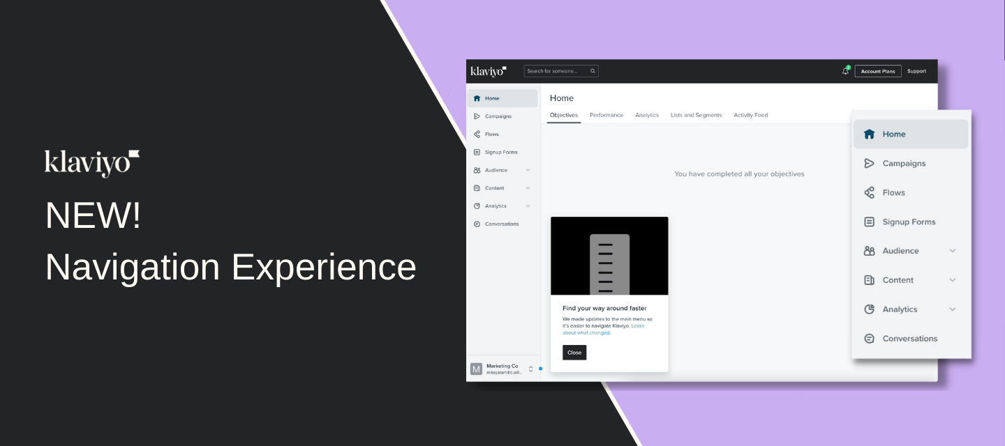
Here is a summary of changes:
-
Our main navigation got a complete redesign
-
We were aiming for simplicity and more of a modern design
-
Our goals were to avoid disrupting workflows and/or discoverability of the tools you use everyday
-
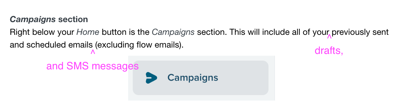
We kept the most used tools at the top level nav (Campaigns, Flows, Signup Forms)
-
Integrations has moved into Settings
-
The nav now incorporates some accessibility enhancements (tabbing support)
-
The Account Switcher menu has now moved (from top right) to the lower left
-
Here is a video walkthrough that I put together with the changes, so let us know...
-
What would you change?
-
What is the new nav missing?
-
What do you like?
-
How has this change impacted your daily workflow on Klaviyo?
-Mike