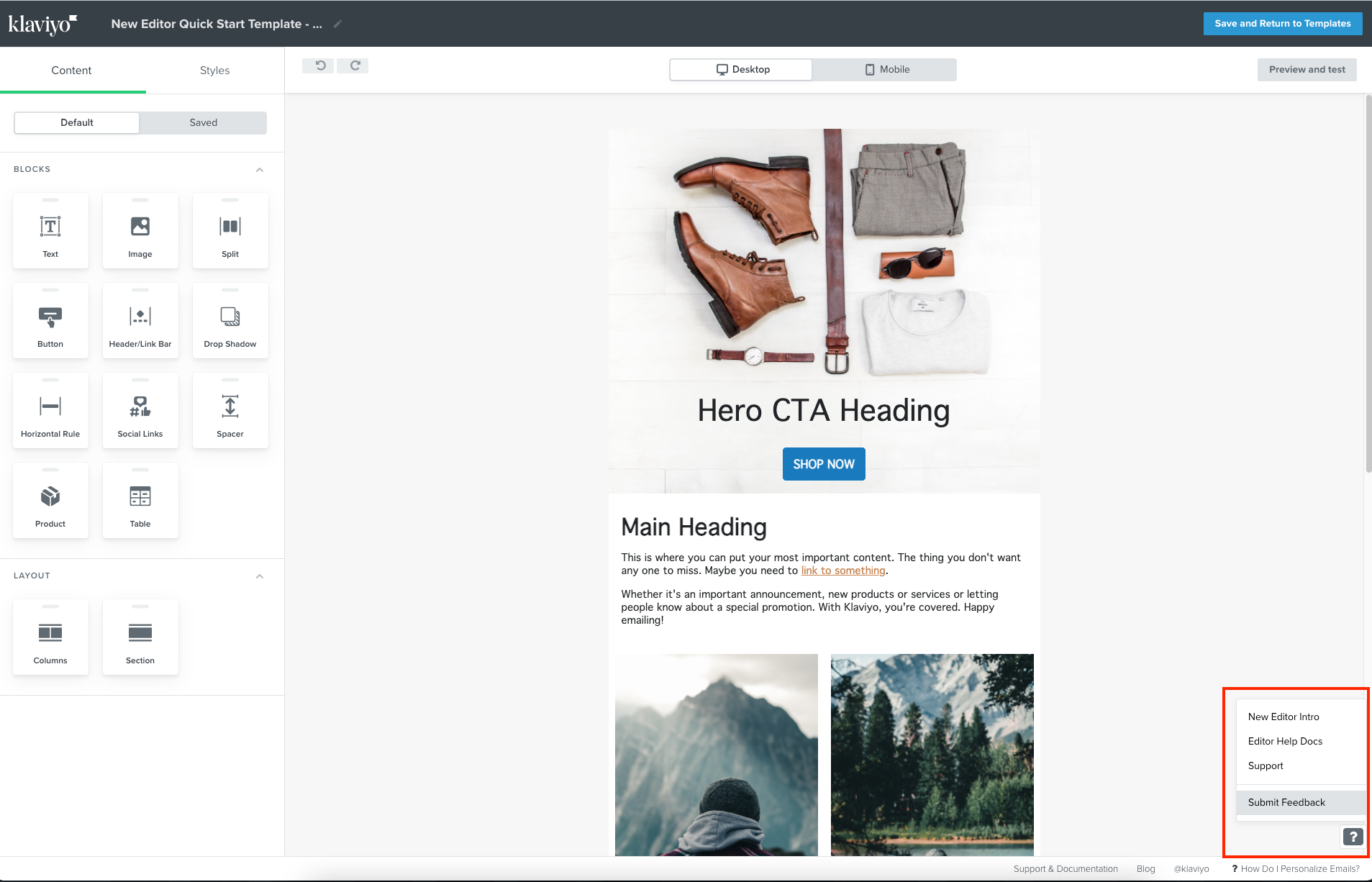
Hi There,
We’re new to Klaviyo (migrating from Campaign Monitor) and have been using your new editor for a month.
There are many great features that overall, are allowing us to create nicer looking designs - control over line-spacing and padding everywhere is a truly a god send so great work!
Some feature requests…
1. A bit slow/sticky to use
- Overall, the editor is sticky compared to Campaign Monitor but seems to degrade the longer it’s open.
- Have tried Chrome, Firefox and Safari on Mac plus we have 64GB of RAM, an 8-core i9 Processor, and a 100Mbps (up/down) fibre connection.
- Have also tried restarting Chrome and the Mac as well as logging-out and clearing cache etc.
- There are definitely long waits (5-10sec) during auto-saving but also long waits (5-10sec) after performing operations like moving, adding and editing blocks. We haven’t timed the waits so maybe they just feel that long.
- There's also a window jump/refresh thing going on and you often don’t notice when the interface has stalled. So you click say, the border switch but as the interface becomes responsive, it jumps down and registers the click on the background colour switch instead. So now you have to wait for it to become responsive, turn off the background colour, wait again, then turn on the border etc.
2. Rename saved blocks
- Keeping things organised with good naming allows multiple people to create consistent design with minimal confusion. However, such is the reality of naming stuff (it’s really hard!) you often end-up having to delete and re-save instead of just editing the name of a saved block.
- It seems that many SASS products force a delete/re-create workflow instead of a more convenient edit workflow which is silly because being able to edit things is the whole point of computers!
- There’s a common ‘minimum product’ or ’agile development’ workflow that often ends-up breaking this fundamental promise of computers - editing stuff.
- If we can see something, humans almost always need the ability to edit it to stay organised.
3. Re-order saved blocks
- For the reasons above, being able to re-order saved blocks is also important if you want to minimise confusion - which quickly happens depending on the multiple types of content your template needs to support.
- I’m sure most of us (especially working in teams) would love to be able to order things manually in a way that suits them - like most used first, or alphabetically, or by template section order (like header-related blocks, then content blocks, then footer blocks etc).
4. Group saved blocks into folders
- On the same organisational theme, we can quickly envisage needing to group saved blocks into folders for painless organisation and quick recall.
5. Save default blocks with template
- Although the star system is great for content, it's not so great for default block styles.
- Button styles should absolutely be saved as part of the template (like CM) so that blocks which also contain buttons (like product blocks) get your button styles auto-applied.
- Another example is default spacing for all blocks and areas. While designers instantly notice spacing, others don't and the difference between 18px and 30px margins can easily destroy a crisp design.
- And with multiple rounds of changes, it's quite easy to drag a default one to replace a block that was deleted during a previous change.
6. Option to show saved blocks first
- Once a template is configured, it's your SINGLE SOURCE OF TRUTH.
- Therefore, you don't want staff using default blocks unless they have to.
- It'd be really useful to configure an option that moved the saved blocks tab to be shown first with default blocks second.
7. Lower case, upper case, sentence case
- Title says it all, staff are writing content and it's a bit painful to copy/paste text from a seperate text editor just to get these features.
- But LOVE the other features like line-spacing (which CM doesn't have) and strike-through which took CM literally years to add!
- If we’re missing something obvious here, let us know!
8. Funky text block spacing
- It's great having extra spacing control on text blocks (please don't remove) but there's inconsistent behaviour as described here: https://community.klaviyo.com/email-templates-and-coupons-32/new-editor-inconsistent-left-right-padding-between-different-blocks-on-mobile-3935
If there are workarounds for the above issues then let us know. Overall, great work but the first two requests make life fairly painful while using the product.
Hope that all makes sense!
Cheers
Ben


![[Academy] SMS Strategy Certificate Forum|alt.badge.img](https://uploads-us-west-2.insided.com/klaviyo-en/attachment/2f867798-26d9-45fd-ada7-3e4271dcb460_thumb.png)

