

ajohns
Problem Solver I
Problem Solver I
September 27, 2022
Solved

Left text alignment issue: desktop perfect, mobile version contains too much space at left

  • September 27, 2022
  • 2 replies
  • 661 views

Hi there,

I’m using the new drag & drop editor to create a template, and I’m experiencing the following issue:


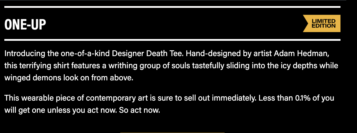
This headline (contained in a <p> tag) looks the way I want it to in desktop...
...but adds extra space at left in mobile.
Desktop looks perfect...
The headline (that says “ONE-UP”) is perfect in mobile (this headline is inside a table cell), but the copy below it is adding extra space at the left.

Any help would be appreciated!

Thanks

    This topic has been closed for replies.
    Best answer by ajohns

    I simply placed the headlines in a table cell, and that eliminated the problem. It now looks the same in desktop and mobile.

    2 replies

    chelsgrove
    Partner - Gold
    Partner - Gold
    September 28, 2022

    Hi @ajohns!

    A short-term solution would be to create these blocks specifically for Mobile and Desktop separately. There is an option to only show a block on each platform. If working primarily in the desktop view, I would then duplicate your blocks, mark them all as desktop only, and then switch over to mobile, format there and then mark those as all mobile only.

    Let me know if you have any questions!

    ajohns
    Problem Solver I
    ajohnsAuthorAnswer
    Problem Solver I
    September 30, 2022

    I simply placed the headlines in a table cell, and that eliminated the problem. It now looks the same in desktop and mobile.