
Hi there,
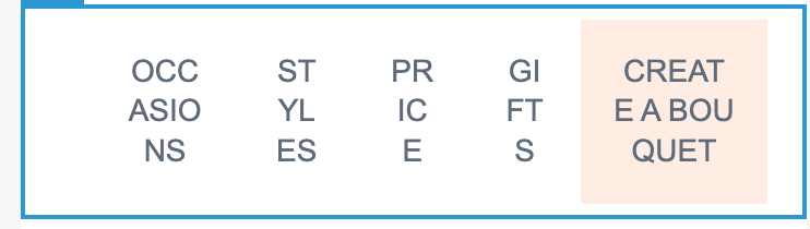
I have a text block with our custom header menu I want to use in our new Klaviyo Template. I am using the new builder. The code works great for Desktop view, but not for mobile. I want to be able to drop the last menu item to underneath the other menu items on mobile, like in the example attached.
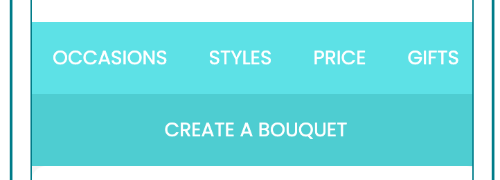
Currently my code gives me this:
Can you please help edit my code?
Code:
<table border="0" width="100%" cellspacing="0" cellpadding="0">
<tbody>
<tr>
<th class="column-top bg-nav" style="font-size: 0pt; line-height: 0pt; padding: 0; margin: 0; font-weight: normal; vertical-align: top;" valign="top" bgcolor="ffffff">
<table border="0" width="100%" cellspacing="0" cellpadding="0">
<tbody>
<tr>
<td class="text-14 c-black l-black tdn p-15 pl-30 mpl-15" style="font-size: 11px; line-height: 22px; font-family: Poppins, Arial, sans-serif; text-align: center; min-width: auto !important; color: #ffffff; text-decoration: none; padding: 15px; padding-left: 30px;">
<div><a href="https://www.flowersacrossmelbourne.com.au/occasion/anniversary/" target="_blank" class="link tdn c-white" style="text-decoration: none; color: #5e6b7a;" rel="noopener"><span class="link tdn c-white" style="text-decoration: none; color: #5e6b7a;">OCCASIONS</span></a></div>
</td>
<td class="text-14 c-white l-white tdn p-15" style="font-size: 11px; line-height: 22px; font-family: Poppins, Arial, sans-serif; text-align: center; min-width: auto !important; color: #ffffff; text-decoration: none; padding: 15px;">
<div><a href="https://www.flowersacrossmelbourne.com.au/style/bouquets/" target="_blank" class="link tdn c-white" style="text-decoration: none; color: #ffffff;" rel="noopener"><span class="link tdn c-white" style="text-decoration: none; color: #5e6b7a;">STYLES</span></a></div>
</td>
<td class="text-14 c-white l-white tdn p-15" style="font-size: 11px; line-height: 22px; font-family: Poppins, Arial, sans-serif; text-align: center; min-width: auto !important; color: #ffffff; text-decoration: none; padding: 15px;">
<div><a href="https://www.flowersacrossmelbourne.com.au/flowers-by-price/?high=49&low=20/" target="_blank" class="link tdn c-white" style="text-decoration: none; color: #ffffff;" rel="noopener"><span class="link tdn c-white" style="text-decoration: none; color: #5e6b7a;">PRICE</span></a></div>
</td>
<td class="text-14 c-white l-white tdn p-15" style="font-size: 11px; line-height: 22px; font-family: Poppins, Arial, sans-serif; text-align: center; min-width: auto !important; color: #ffffff; text-decoration: none; padding: 15px;">
<div><a href="https://www.flowersacrossmelbourne.com.au/extras/alcohol/" target="_blank" class="link tdn c-white" style="text-decoration: none; color: #ffffff;" rel="noopener"><span class="link tdn c-white" style="text-decoration: none; color: #5e6b7a;">GIFTS</span></a></div>
</td>
</tr>
</tbody>
</table>
</th>
<th class="column-top bg-nav-btn" style="font-size: 0pt; line-height: 0pt; padding: 0; margin: 0; font-weight: normal; vertical-align: top;" valign="top" bgcolor="#FFEDE3">
<table border="0" width="100%" cellspacing="0" cellpadding="0">
<tbody>
<tr>
<td class="text-14 c-white l-white tdn p-15" style="font-size: 11px; line-height: 22px; font-family: Poppins, Arial, sans-serif; text-align: center; min-width: auto !important; color: #ffffff; text-decoration: none; padding: 15px;">
<div><a href="https://www.flowersacrossmelbourne.com.au/create-a-bouquet/" target="_blank" class="link tdn c-white" style="text-decoration: none; color: #ffffff;" rel="noopener"><span class="link tdn c-white" style="text-decoration: none; color: #5e6b7a;">CREATE A BOUQUET</span></a></div>
</td>
</tr>
</tbody>
</table>
</th>
</tr>
</tbody>
</table>