I am trying to create flows, but when I select our logo for the image it looks HUGE in mobile, and doesn’t let you move from side to side to view the whole image. It is fine for desktop, but not mobile - so I don’t to select “show on both desktop/mobile.”
Please help!
Page 1 / 1
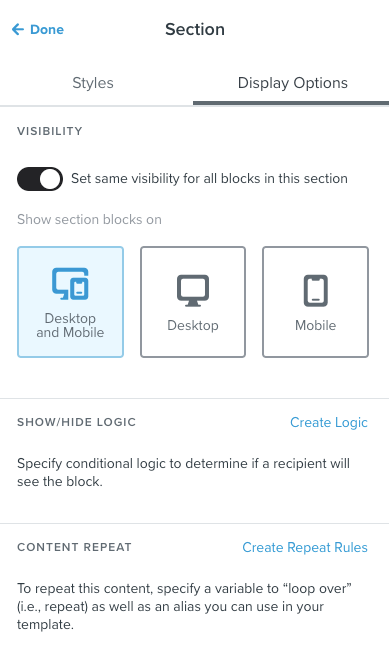
You could create a mobile specific section and a desktop specific section for the logo. This way you could better match the design to the device. If you click on the section and toggle on “set visibility” you’ll see the options to do this.
Hi @CourtneyAcosta, I'm actually not so font of using that option.
My advise would be to use a simple html hack to get your image looking great.
By any chance are you using Outlook on iOS? Because that's been a dragon to get working correctly.
In short you need to set a width and height for your logo. If you don't it will basically use the size of the image. The alternative is to scale the logo image exactly to the right size pixel wise and upload that.
For the html part you will probably have <img …. style="width:100px; height:100px;”>
if that's the case make sure you also add width and heigth like so and your problems will probably be gone: <img src=…. style="width:100px;height:100px;” width=”100” height=”100”>