



How we made our Klaviyo signup forms convert better (7 small changes, one big rethink)

Once I started treating our Klaviyo signup form as something worth testing and tuning, our submit rate moved — and so did the quality of who ended up on our list. Before that, I treated it the way most people do: build it once, plug in a discount, forget about it. That mindset cost Boarderie more than I realized. Here's what actually changed things, in the order I'd tackle them if I were starting over.
Is your headline doing its job, or just being clever?
Your headline gets a split second of someone's attention before they decide whether to engage or click away. It needs to be clear enough that a visitor understands what they're getting, immediately.
We had a headline that leaned cute early on, something closer to "Join the Fam" than an actual offer. It didn't convert nearly as well as a plainer version that stated the deal outright: what they'd get and why it was worth their email. Clever can wait. Clear can't.
Speaking of the click away, I asked my fellow Champion,
Should your form fire immediately, or wait?
This is genuinely a testable question, not a matter of opinion. I've worked with teams on both sides of this: some convinced speed wins, others worried that firing immediately reads as pushy before a visitor has any reason to trust the brand.
The honest answer is it depends on your audience, and Klaviyo gives you a few ways to find out. Under a form's Targeting & Behavior settings, you can set a time delay so the form doesn't appear until someone's spent a few seconds on the page, or trigger it off a specific behavior instead: when a visitor's cursor moves toward the top of the browser (exit intent), or once they've scrolled a set percentage down the page. We eventually landed on a short delay plus an exit-intent form as a backup, and let the data settle the debate instead of leadership opinion.
What are you actually asking for, and when?
Every extra field is a reason to abandon the form. We started asking for email, phone number, and name all at once because it felt efficient, and our submit rate told us it wasn't. Now we ask for the smallest thing that's still useful, usually just email, and let a welcome flow do the work of asking for more once someone's shown real interest.
That's the part people skip: the rest of the data isn't lost, it's just collected later, when the ask feels earned instead of presumptuous. Once someone's opened a few emails or browsed multiple product pages, a preference question or a phone number ask lands very differently than it would on day one.
Christian Nørbjerg Enger shared another great tip on this:
"Post-purchase is one of the highest-intent moments you'll ever get. A simple 'Want updates on your order + future drops?' on the confirmation page can out-convert your homepage pop-up."
Does your form know who it's talking to?
A generic form leaves value on the table. Someone landing on a specific product page is in a different headspace than someone browsing your homepage, and Klaviyo's form targeting lets you reflect that: you can target a form to appear only on certain URLs, or personalize what a visitor sees based on their profile data if they're already known to you.
New and returning visitors deserve different treatment too. A new visitor hasn't earned your trust yet, so keep the ask light. A returning customer is a different opportunity: instead of repeating the same discount, use the moment to learn a preference instead. One caveat worth knowing before you build this out: if a returning subscriber ever sees your new-visitor incentive (which can happen if their browser isn't cookied, say they're on a new device or in incognito), they won't trigger your welcome flow the same way, since they're already on the list. A community thread on this exact snag is worth a read before you go live with tiered offers.
"Think of your forms as funnel-based forms. Your offer could be 'save 10% off,' but that offer needs to lead to a valuable suggestion for the customer in the welcome series, not just a discount code. For example, you could offer 10% off their next order, but before they get the code, ask what wine they'd like a suggestion for: red, white, rosé, or sparkling. Then, on the next page, ask what their budget is: 50 kr, 100 kr, 150 kr, or 200 kr. Then ask what country they'd like the wine to come from. It's all funnel-based, because you're using each step to build toward a specific, valuable suggestion, and you can get people to use the discount directly on that suggestion instead of on a generic storewide code."
Is your form actually built for mobile, or just shrunk to fit?
Most of your traffic is probably mobile, and forms that were designed desktop-first and scaled down show it: slow load, tiny tap targets, a close button nobody can find.
The fix isn't a "responsive" version of your desktop form, it's treating mobile as its own design job. Klaviyo lets you build forms specifically for mobile, or edit the mobile and desktop views of the same form separately so each one is actually built for how people are browsing on that device, not just squeezed into a smaller frame.
Have you actually tested that headline, or just assumed it works?
None of the changes above are one-and-done. What converts today can flatten out in six months, and the only way to know is to keep testing. Copy, layout, and offer all deserve to stay in rotation.
Adam Hutton, Senior Manager of Digital Growth at Benchmade, put it well when we were talking about this:
"I'm a firm believer in small, focused tests over constant full redesigns. Things like X button placement, image vs. no image, full screen vs. popup, and CTA copy all have massive gains hiding in them. A lot of people jump straight to offer testing, but that's a slippery slope. A bigger discount might look better on the surface, but it can actually hurt repeat purchases long term."
That last point is exactly where I want to end up, because it's the thing that changed the most for us.
Klaviyo can automatically pick the winning variation once a test hits statistical significance, so you're not sitting on a result you haven't acted on. That's worth setting up for any test you're running. But the more useful shift, for us, was in what we chose to test in the first place.
What's a discount actually costing your list?
A discount is the easiest lever to pull for signup rate, and it's worth asking who it's actually attracting. A percentage off tends to pull in people opting in for the deal, not the brand. There's also a training effect: once someone gets a discount on their first order, they expect one on every order after, and that chips away at margin indefinitely.
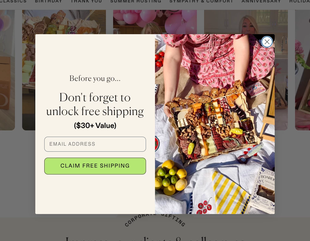
At Boarderie, we tested leading with a free shipping offer instead of a straight percentage discount. Our signup rate dipped slightly compared to what a bigger discount would likely have pulled in, and Klaviyo's own research backs that instinct up, brands see meaningfully higher subscription rates when a discount is on the table. But the tradeoff was worth it for us: the subscribers we did acquire converted at full price more often and came back more consistently. Smaller list, healthier one. If you want to run this test on your own forms, Klaviyo's guide to A/B testing signup offers walks through comparing exactly this: a percentage off against something like free shipping.
That's the real lesson buried in all seven of these changes. None of them require a redesign or a big budget. What they require is treating your form like something worth actively managing instead of setting once and walking away from.
Your turn
Have you tested a lower-value incentive against a discount and watched list quality change? Or found a targeting setup that backfired the way ours almost did? Drop it below, I'd genuinely like to compare notes.