Hey community,
When I’m sending out a newsletter, the format on phone is crazy strange.
Can anyone help me out?
please check attached

Hey community,
When I’m sending out a newsletter, the format on phone is crazy strange.
Can anyone help me out?
please check attached

Hi
Are you using the classic editor or the new editor? If you’re using the classic editor, here’s a few troubleshooting tips I go through when I’m trying to fix or optimize mobile designs:
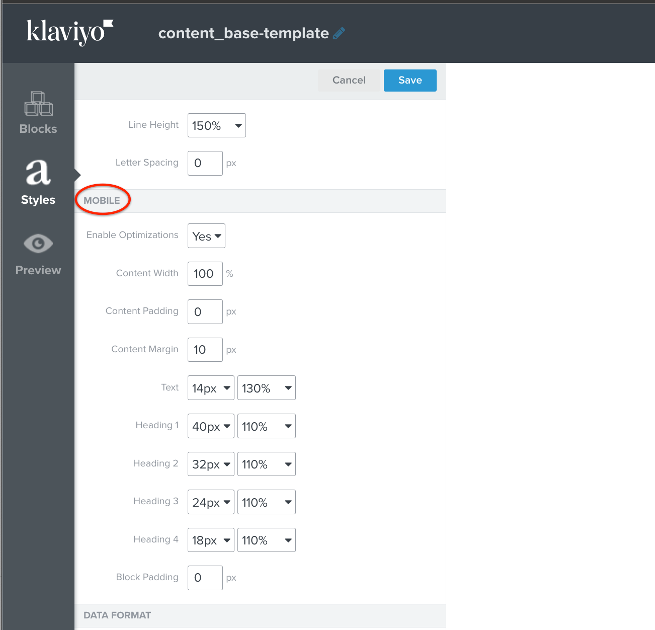
Check your Default Style Settings
Check the settings in the Mobile section of your Default Styles. In most cases, I use 100% Width, with a 10px content padding and zero out everything - this adjusts the width to the maximum width of the mobile view port. I also “Enable Optimization” so Klaviyo handles some of these adjustments for mobile as well. See here:

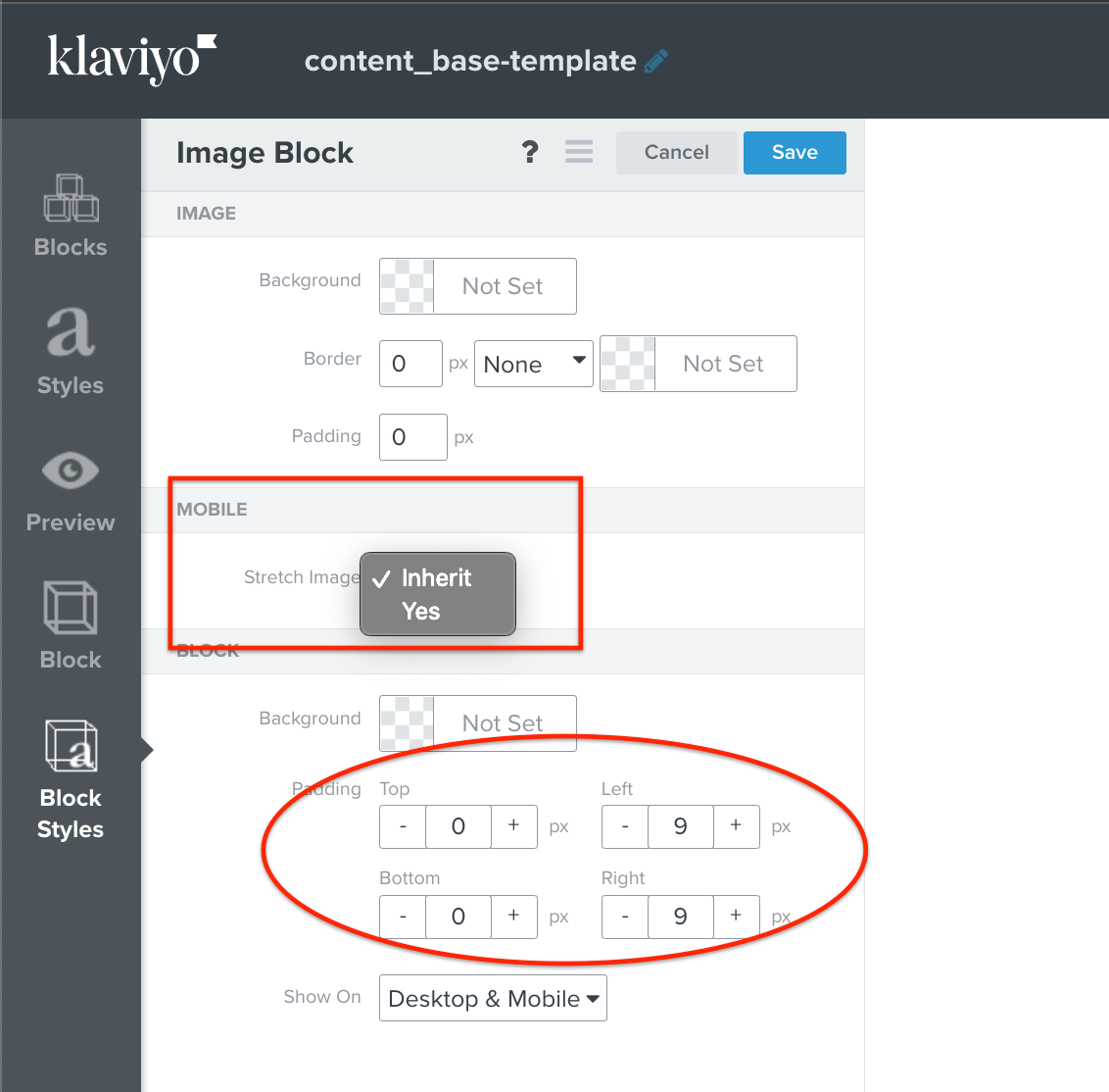
Check your Block Styles Settings
If the strange width or padding issues is happening only to a few select Blocks, check the Block Styles settings and make sure the Padding / Margins are set accordingly. You may also want to toggle the “Stretch Image” or “Stretch Content” option for Mobile to see if it works.

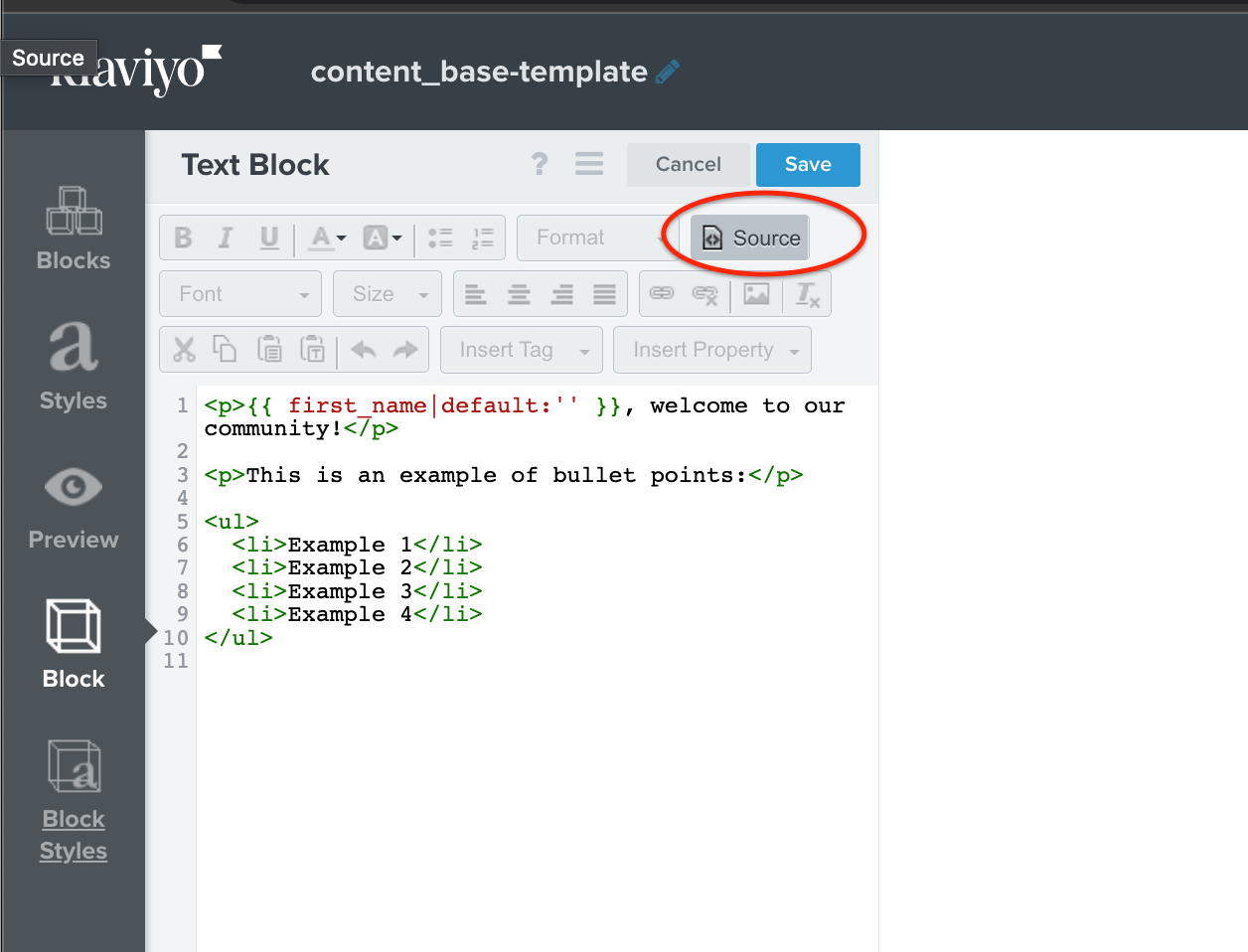
Check for Unnecessary Inline HTML/CSS in Text Blocks
For Text Blocks, check the Source code to make sure there aren’t any superfluous HTML/CSS code that might be impacting the way the Block is rendering. Typically, this can happen when you copy/paste from another application that carries over the Style encoding.

If you find a bunch of extraneous HTML/CSS, you can highlight everything and click the Clear Formatting icon (the T/x icon). Then format it within the Text Editor. If you’re fluent in HTML/CSS, of course you can adjust it as necessary.
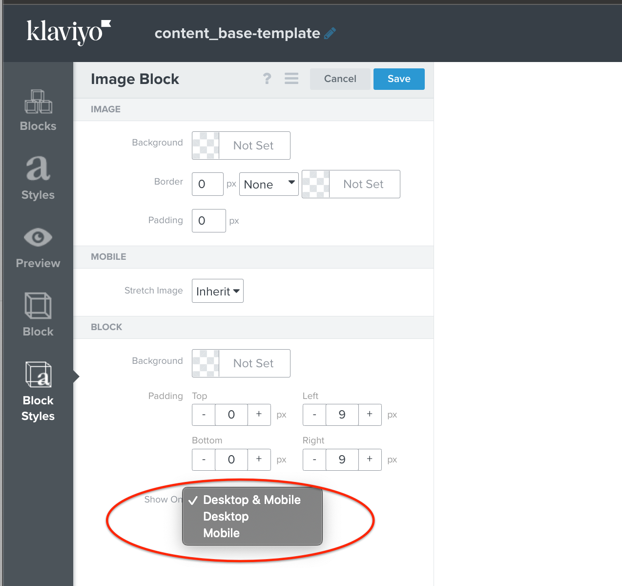
Create Separate Mobile and Desktop Blocks
In some more extreme situations, you can consider duplicating a Block and making a separate Mobile version of the Block that is specific to mobile view. This takes a bit more effort, but then you can adjust it accordingly. Every Block in Klaviyo lets you set if it should be shown on Desktop, Mobile, or Both. So you can have one Block set for Desktop, and the duplicated and Mobile Optimized Block set to Mobile.

Simplify, Reduce, and Test and Test and Test...
Finally, there are just some situations where email doesn’t look right in all email clients. For example, the Desktop Outlook version is a common offender that doesn’t render Email consistently. In those situations, I try to simplify the layout, reduce or remove complex HTML elements if possible, or try to rebuild them within the Klaviyo Editor.
Hope these tips help!
Hi
Thanks for sharing your question with us!
Thanks for participating in the Community!
-Taylor
Enter your E-mail address. We'll send you an e-mail with instructions to reset your password.