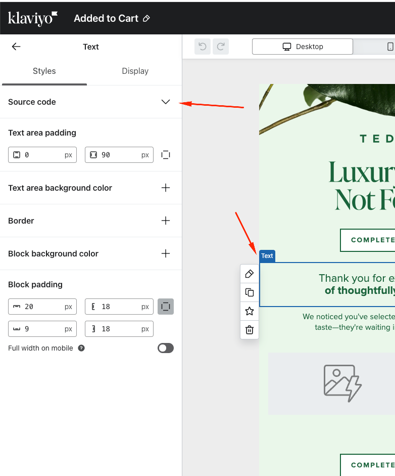
Hi Klaviyo Community,
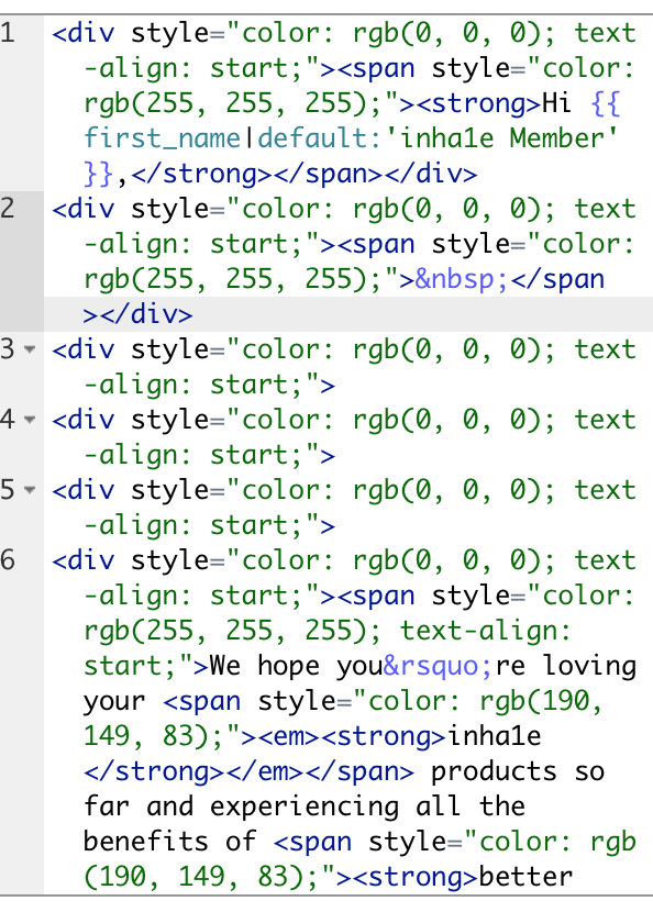
I’m having trouble with the text color changing when viewed in dark mode on mobile devices. I’ve looked through other forums, and many suggest changing background images or section images to resolve dark mode issues. However, the background color is displaying correctly—the problem is with the text colors themselves, which seem to change when dark mode is enabled, making parts of the text difficult to read.
Is there a way to set specific text colors in Klaviyo that won’t automatically change in dark mode? I want to keep the email design consistent and readable across both light and dark modes without having to compromise on the colors I’ve chosen. Any advice or tips on how to optimize my email for dark mode while maintaining my brand’s style would be greatly appreciated!
Thank you in advance for your help!


