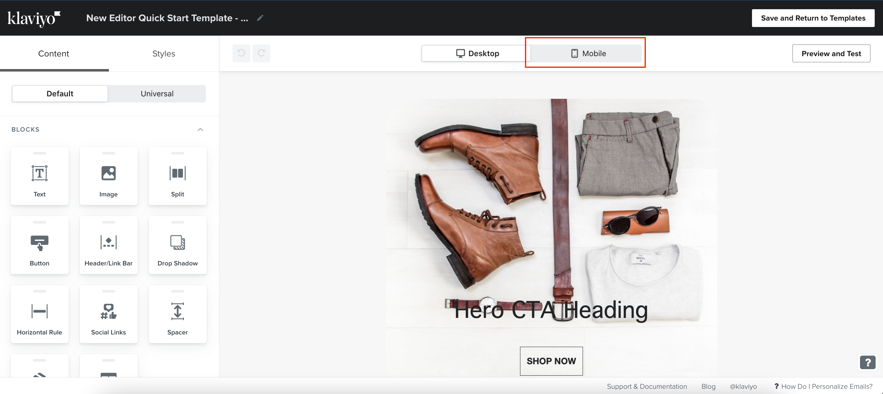
In my last Community post, Sections and columns in the new editor, I explained how the new section and column layouts work.
In the new editor, you can now add sections with two columns. Columns can be vertically layered. Meaning, on the left hand side (for example) you can add a text block and a button block underneath it, while on the right side, an image block.
This format is great for showing and describing a new product or service. The button within the section directs the viewer to read more/purchase the product after reading about it and seeing the picture. This is a proven successful design, meaning formats like this receive high click rates. Sections can have background colors added to the entire section, so spacers are not needed anymore to ‘fill in’ the color.

