Hi Y’all,

Kind of a entry level question here but can’t find the right answer so I thought I’d post here.

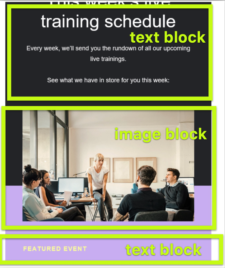
How do I work the settings within the editor to have the background split color in the middle of the photo like in this example? I’m sure it’s an easy answer but I can’t figure it out to save my life 🙃

Thanks!


Hi @jlomes ,

Welcome to the Community.

From a design aspect, this is probably one of our custom image backgrounds that we use for emails. There is only 1 solid color option per block. However, you could stack blocks next to each other to create this or use your own personalized background image.


Thanks,

Alex


You need three blocks to do that. See image below..


+1 for @takendigital method


What I’ve noticed though, is that if you design an image on Canva and have that purple in the bottom (like in the example above, using the same colour in the text block will create a line. How do you avoid this?


Reply