I’m a long time Klaviyo user and huge fan of the product. While the editor is certainly one of the simplest out there, it lacks some features that seem like no-brainers.

For the last 5+ years I’ve been providing feedback to my various account managers on how to improve the template editor so I was excited to hear that a new version was being launch. 

Unfortunately after checking it out, there are still some glaring misses.

  1. My biggest gripe over the years with the Klaviyo editor is the inability to edit mobile specific styles at the block level. While you can set mobile settings as the template level, there is no simple way to adjust things such as font size, padding, background color, etc. specifically on mobile. While you can duplicate a block for desktop and mobile to style them differently, this creates unnecessary work and opportunity for error. 
  2. No simple way to add custom fonts like in forms. Yes you utilize custom fonts by adding css in a <style> tag in a block at the top of the email, but I figured at this point Klaviyo would have a simple way to just call custom fonts at the template level.
  3. No easy way to reorder content when you have a long email. Sure you can drag and drop, but this isn’t ideal when you have a long template. You have to drag and drop then scroll down to drag and drop again.

If anyone has guidance on how they’ve handled #1, I’d love to hear about it.

Keep up the good work Klaviyo!

Hi @bmask


Welcome to the Community! Glad you have recently joined the collaborative space after being a long-time Klaviyo user, happy to have you! 


Thank you so much for sharing your feedback with us! Would love to share some more helpful insight on this. 

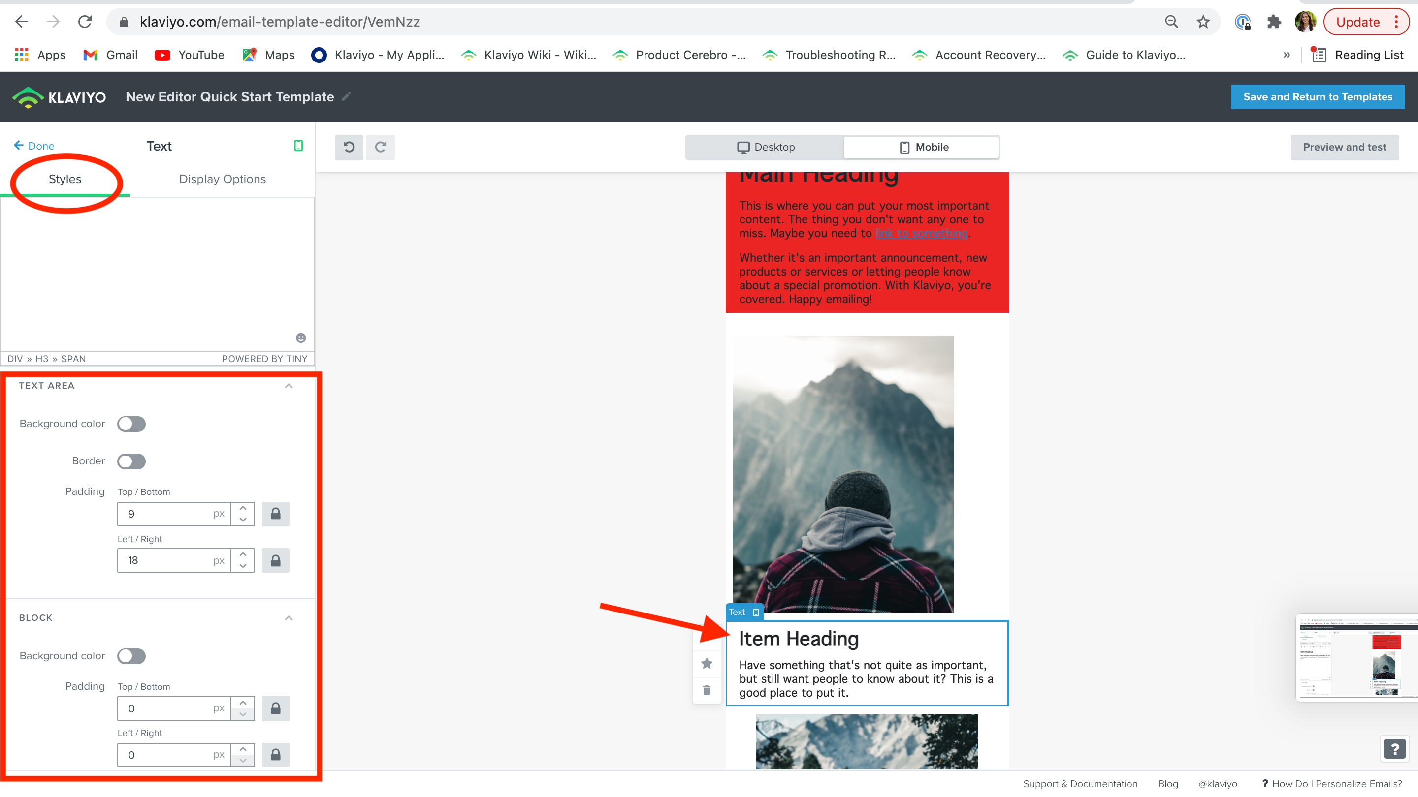
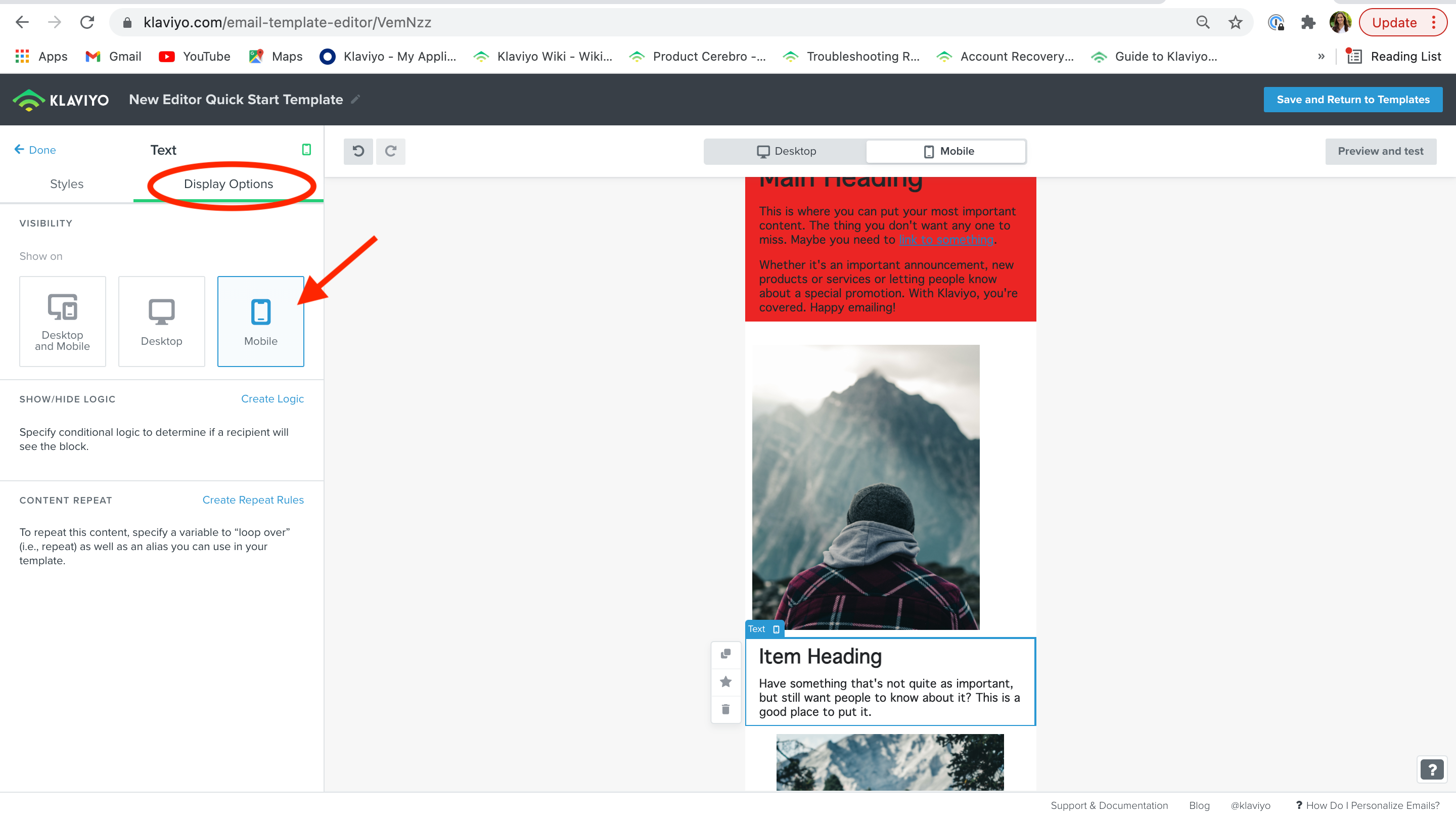
To your first point, I’m happy to share that these feature are available to use in our new template editor! You can adjust font size, padding, background color etc in the text block itself, shown below. I have clicked into the text block and can navigate to these setting in the ‘Styles’ tab, while choosing the mobile display only when I toggle to ‘Display Options’.


To your second point, yes! Uploading custom fonts to our new template editor will soon be as simple as adding it to a signup form builder. This feature is set to be released in the very near future, so keep your eyes peeled. 


To your last mention, do you mind sharing your feedback on how you would like to see content organized? I can see that it would take a while to drag-and-drop a certain block at the bottom of a long email to the top. A potential idea would be to  save the block you are looking to move and add it upon scrolling to your desired relocation area. 


However, if I misunderstood your questions in any way, please clarify your original question’s intent and I would love to follow up again. 


Thanks for being a part of our Community!

-Taylor 


Thanks for the reply Taylor. 

The solution you mentioned to my first point doesn’t solve what I’m referring to. The ability to create a block, apply styles and then show only on mobile has always been a feature. The issue here is that when you have the same content that you want to show slightly differently on desktop vs. mobile (usually padding or font size), you have to create a duplicate blocks with their own style settings. This causes unnecessary work and opens up additional opportunity for error. For example, when the blocks are in a template you may forget to update the text in both mobile and desktop. Considering you can create mobile specific styles via css and media queries, it would seem that within each block Klaviyo could easily have both a desktop AND mobile styling section. Does that make sense?

For the third point, I’ve seen some other tools where you click a move icon which puts the block/section in “move mode” and you can then hover over and click where you want to drop it. Your solution would work, but then causes you to save blocks that you may not need later on. On that point, it would also be nice if you could edit the name of saved content and see a preview image to remind you exactly what it was.


Hi @bmask


Got it! I follow you completely now, thanks for that additional clarification I needed. 


I agree, this would be two helpful features! Thank you for helping us know how to make our product better! We deeply value the advice of our customers and I will submit this feedback to the product team. 


Thanks for sharing your helpful insight with the Community! 

-Taylor 


Reply